IBM logo vector
The International Business Machines Corporation (IBM), nicknamed Big Blue, is an American multinational technology corporation headquartered in Armonk, New York.
It specializes in computer hardware, middleware, and software, and provides hosting and consulting services in areas ranging from mainframe computers to nanotechnology. IBM is the largest industrial research organization in the world.
- Formerly: Computing-Tabulating-Recording Company (1911-1924)
- Founded: June 16, 1911
- Website: ibm.com
IBM logo svg
IBM Logo Evolution Story
Founded in 1889, IBM is one of the major software and hardware development and supply companies, which also specializes in consulting and IT services. While it’s regarded as one of the most progressive and technologically groundbreaking firms in the world, the logo is also one of the finest and most striking examples of graphic design to grab the audience’s attention.
Designed by Paul Rand, the most widely recognized and appreciated graphic designer of the previous century, the current IBM logo is suggestive of the uniqueness, confidence, and superiority of the company’s products. It also plays a crucial role in promoting the brand in the global Information Technology market. However, the earliest version of the logo was far from what it looks today. Let’s take a quick look at how the emblem has evolved with time.
IBM Logo Design from 1889 — 1914
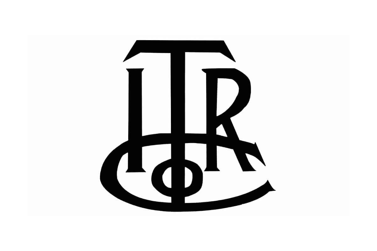
IBM Logo from 1889 — 1914
Established out of a merger of two companies, International Time Recording Company and Computing Scale Company, IBM’s visual identity has been pretty consistent with a few changes here and there. Its initial logo was launched in 1889, featuring an elegant and chic ITRCo monogram, designed in a straight serif typeface and a monochrome color palette.
IBM Logo Design from 1891 — 1914
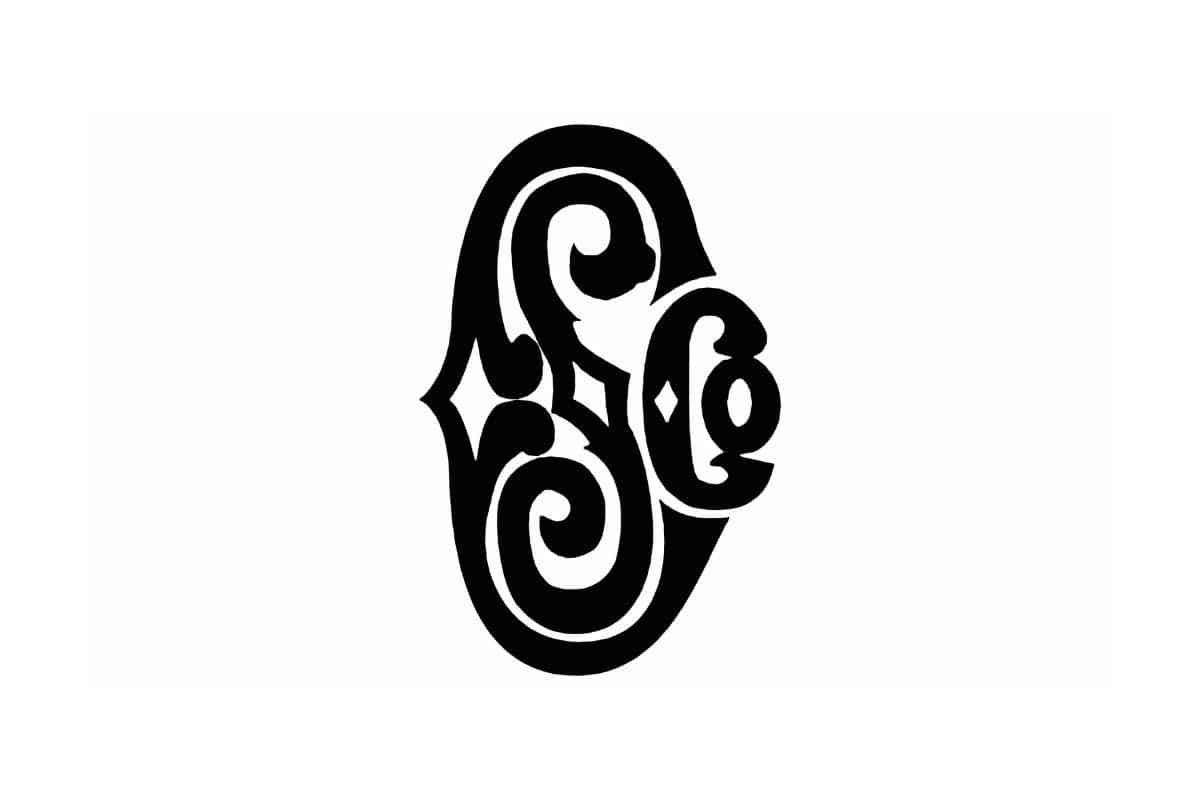
IBM Logo from 1891 — 1914
Almost in line with the first logo, the second one appeared when the company was renamed as The Computing Scale Company. The management used the monogramming technique to use the abbreviation for the company name. CSC was featured in a different design, with the letter “C” in a large font, followed by “S” in the center, and a smaller “Co”. The letters in the logo used an ornamental font.
IBM Logo from 1910 — 1924
IBM Logo from 1910 — 1924
The companies merged into Computing-Tabulating-Recording Company in 1910, and its logo was created in the same year. The new logotype was enclosed in a thin circular frame, executed in a striking and bold custom typeface. Here, the letters had a specific arrangement – there’s a large, straight “T” in the foreground, an “R” in the background with a long and curved tail, and both the “C”s were designed in a wishbone-style. The leg of the letter “T” passes through the curl “R”, and the entire logo has a printed look.
IBM Logo Design from 1924 — 1947
On February 14, 1924, the company was renamed as International Business Machines Corporation or IBM, and for the first time the company’s full name was used as a basis for the emblem. The words were written in the form of a globe, with a broad equator encircling it. The word “Business” is placed at the top, “International” in the middle, and “Machines” below, signifying the worldwide coverage of different nations with innovative technologies. The IBM logo was also suggestive of the company’s willingness to enter the international market and emerge into a big player.
IBM Logo Design from 1947 — 1956
IBM Logo Design from 1947 — 1956
The name International Business Machines was replaced with its abbreviation IBM in 1947. The new logo is simple yet strong; it featured a calm and light blue logotype with the capital letters in a square and gigantic shape of a serif typeface.
IBM Logo Design from 1956 — 1967
IBM Logo Design from 1956 — 1967
The rebranding of 1956 revised IBM’s logo typeface (stretching the serifs and making them more noticeable) but kept the color palette untouched. Another modification was done to the negative space of the letter “B”, which was changed into two white squares. The simple lettering format didn’t just make IBM more popular and friendly but also conveyed the company’s warmth and user-friendliness to its audience. Such a striking logo design will instantly let the potential customers know about the company, when used on their business card. Even if the recipients weren’t aware of the brand name IBM, they got to know so from the card itself.
IBM Logo Design from 1967 — 1972
IBM Logo Design from 1967 — 1972
1967 was a significant year in the history of the IBM logo. It was then that the first version of today’s iconic IBM logo was designed by the famous graphic designer, Paul Rand. It was somewhat similar to the previous design, where the blue word mark was horizontally cut into 13 equal strips. Why so many stripes? As the author intended, this width was ideal to understand that these were improvised wires. They were just in proportion with the size of the letters.
IBM Logo Design from 1972 — Present
IBM Logo Design from 1972 — Present
A slight logo redesign was undertaken in 1972 and the thirteen stripes were replaced with eight. Although the number 8 is assumed to characterize the 8-bit system, the developer himself claims that the stripes represent speed and dynamics, which are typical of the company’s production and distribution system.
As for the light blue color of the logo, it has a soothing effect on the audience’s mind and is often associated with depth, stability, trust, loyalty, and ingenuity. They also express a sense of strength, professionalism, and supremacy. It is an extremely expressive logo that’s symbolic of their dedication, hard work, and professionalism.
IBM Logo Redesign in 2018
IBM Logo Redesign in 2018
In 2018, the company decided to revoke its original “full” logo, designed in 1956 but with a significant change in its color palette. This time, it was a white “IBM” word mark, placed against a solid gray horizontally-oriented background. Aside from the typical blue and white striped version, IBM also uses this strict grey and white version of their logo. The bold visual represents the stability and dependability that IBM provides to its customers.
The logo uses a serif font and is strikingly simple yet memorable. The letters I, B, M, are in bold, simple letters, with the top and base of the ‘M’ somewhat extended. The logo is scalable and versatile, and can be used on billboards as well as small product labels.
One of the biggest reasons behind the success of the IBM logo is its unique concept. The linear take on the logo design in 1967 by the graphic designer is truly commendable. There is probably no other logo that features an entirely striped design. This uniqueness makes the logo stand out in the crowd. The design looks great on advertisements and helps people notice the content of the ads.
IBM’s slogan, simply THINK, was coined by Thomas J. Watson in December, 1911. The highly successful ThinkPad is also named after this slogan. The series of laptops and tablets launched by Lenovo is now categorized under the IBM merchandise. The ThinkPad series that supposedly offers smarter, premier devices can be found in any IBM partner store.
[suorce]
By downloading this artwork you agree with our terms of use.
🤔 Not the logo you are looking for? Click here to try a search
Starting download...
5Copy and paste the code for attribution:
Copied

