50 famous logos with hidden meanings
Logos are everywhere. On the clothes we wear, on the phones we use, and on the food we buy—we’re surrounded. Some logos are incredibly straightforward—a letterform or a pictorial representation—and some are more complex. But one thing you can’t deny is that the meaning behind a logo informs the audience of what your brand is all about.
Many of us don’t even consider what these logos mean beyond the fact that they represent some of our favorite brands. But what we don’t realize is that many of them have a deeply rooted meaning hidden in or behind the famous symbol, and in this article we’ll uncover them.
Here are 50 hidden meanings behind 50 of the world’s most recognizable logos.
01. Beats

The logo for Beats by Dre is pretty simple. The ‘b’ is enclosed in a circle followed by the brand name. The circle, though, isn’t just a circle. It actually represents a human’s head, and the ‘b’ letterform represents the brand’s headphones. This gives the brand a personal element, allowing a customer to see themselves in the headphones.
02. Cisco
![]()
Cisco, the worldwide leader in networking for the internet, is named after its headquarters’ location in San Francisco. While its namesake doesn’t have a hidden meaning, the blue stripes above the logotype not only represent an electromagnet but also, the Golden Gate Bridge.
03. NBC
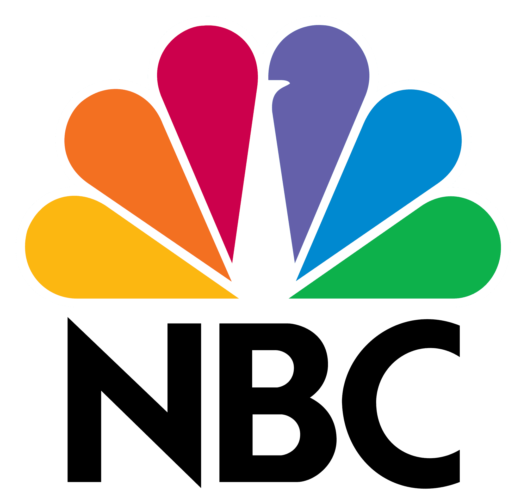
NBC’s logo has a couple of hidden meanings. It’s clear that it’s a peacock, but why? When the logo was developed color televisions were being introduced (explaining the rainbow of colors), and the network wanted a logo that would cause black and white tv owners to make the switch. So, they went with the common phrase (at the time), ‘proud as a peacock’, promoting that they were proud of their new color system. The six different colors of the feathers represent the six different divisions of NBC.
04. Amazon
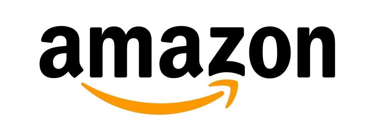
Amazon is a powerhouse when it comes to online shopping, and their logo reflects that. The yellow arrow in their logo starts at the letter ‘a’ and ends at the letter ‘z’, implying that they sell everything from a to z. The arrow also represents a smile, with the arrowhead being a stylized dimple or smile line. The smile indicates the happiness people feel when they shop with Amazon.
05. Baskin Robbins
![]()
Baskin Robbins is known for its seemingly limitless flavors of ice cream (31, if we’re being exact). That famous number is hidden in the ‘B’ and the ‘R’ of their logo, acting as the curve of the ‘B’ and the stem of the ‘R’. The logo represents fun and energy, much like how you’ll feel during (and after) eating their ice cream.
06. Roxy

Roxy is Quicksilver’s female clothing line. To appeal to their female audience, they use a heart as their logo, drawing inspiration from the feminine shape and connotation behind its meaning. And it’s not any ordinary heart—it’s actually two Quicksilver logos turned on their ends.
07. Vaio

Sony Vaio, aka Visual Audio Intelligent Organizer, is known worldwide for its technology, but not everyone knows the meaning behind its logo. Vaio represents the integration of both analog and digital technologies in its products. The letters ‘va’ are made to look like an analog wave, while the ‘io’ resemble the numbers 1 and 0, representing a digital signal or binary code.
08. Picasa
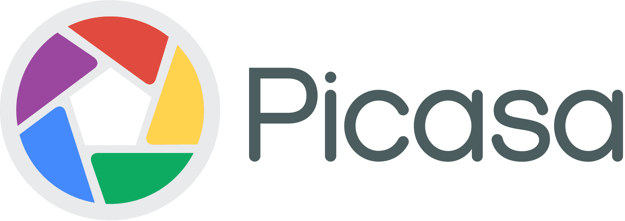
Picasa, Google’s former image organizer and editor, has an interesting logo mark. At first glance it looks like a simple camera shutter, but the negative space in the center of the shutter actually forms a house. This is because Picasa is considered ‘home’ for all of your photos, and casa in Spanish means home.
09. Museum of London
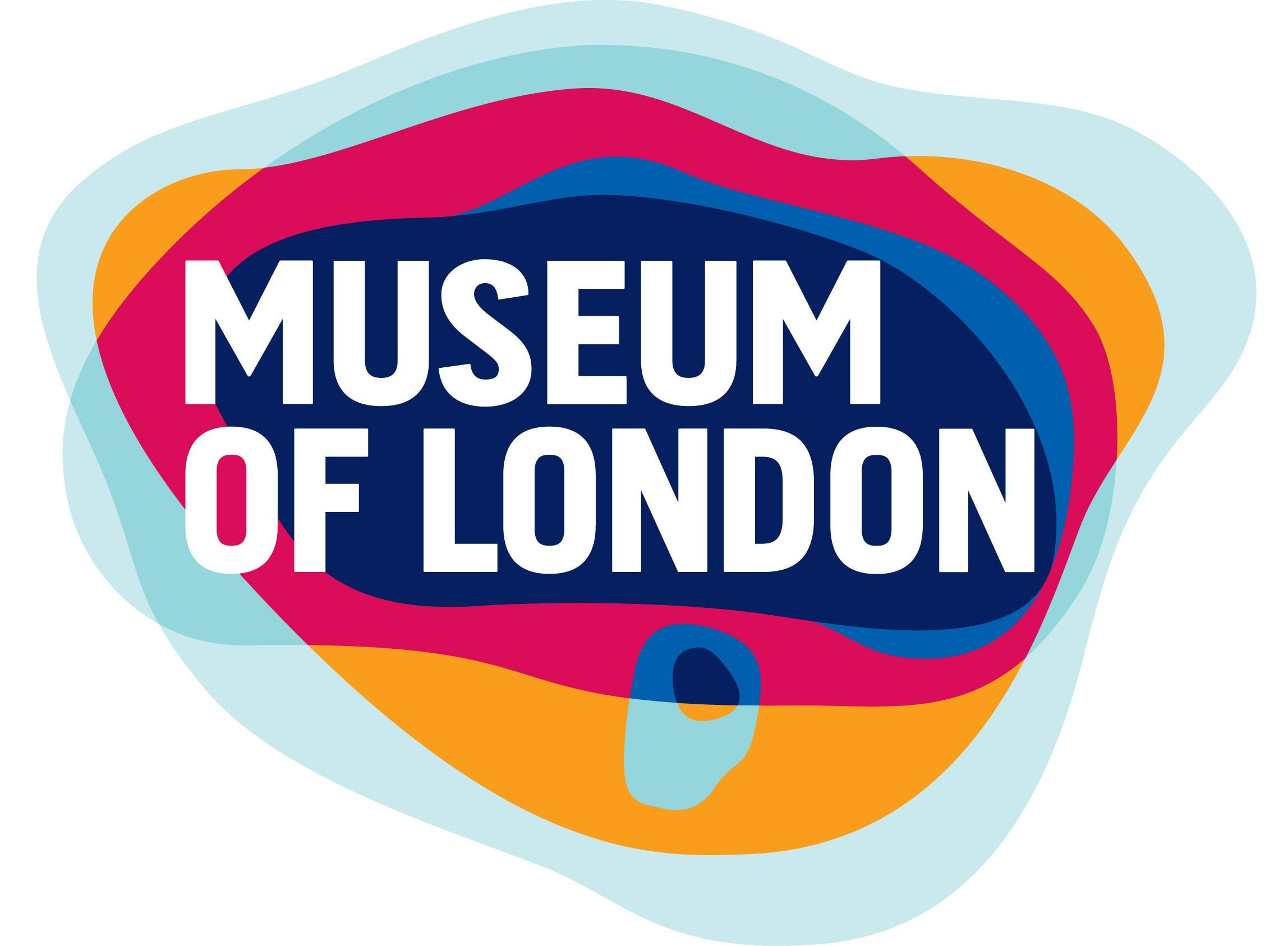
The Museum of London has an interesting, organic look. The shapes of color actually represent something, though, and aren’t just abstracted blobs of color. They show the geography of London and how it has changed over time, representing the constant change of London and its people in the past, the present, and looking towards the future.
10. Eighty 20

Unless you’re really good at math, you probably wouldn’t be able to guess the meaning behind Eighty 20’s (a South African analytics consultancy) logo. The squares actually represent the binary pattern for 1010000 and 0010100, which mean eighty and twenty.
Get this look in Canva:
11. London Symphony Orchestra
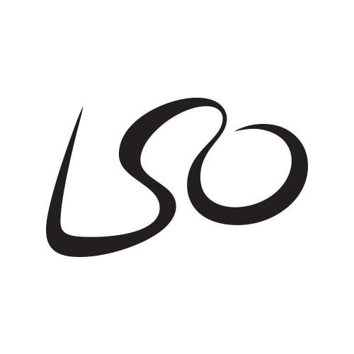
The logo for the London Symphony Orchestra can’t only be read as the initials ‘LSO’, but also as an orchestra conductor. The elegant way it looks (almost script like) adds to the elegance of the orchestra. Which did you see first?
12. My Fonts
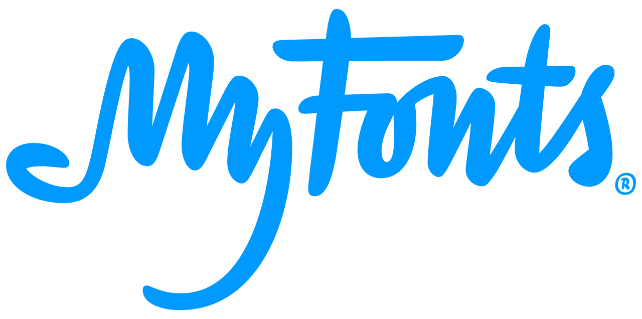
My Fonts is an online font resource, allowing users to access a number of fonts. The ‘My’ in My Fonts is stylized to look like a hand, giving the impression that users can get their hands on whatever fonts they’d like.
13. Le Tour De France

Le Tour De France logo has two hidden messages inside of it. The first is a bit more obvious, with a cyclist making up the letter ‘r’, but the second is more subdued. The yellow circle that acts as the bike’s wheel is also a sun, indicating that the events of the race only occur in the daytime.
14. AG Low

Rebecca Low
AG Low, a construction company, has a simple logo. It spells out the name of the company — though in a unique way. It’s laid out to look like the floorplan of a home.
15. Galeries Lafayette
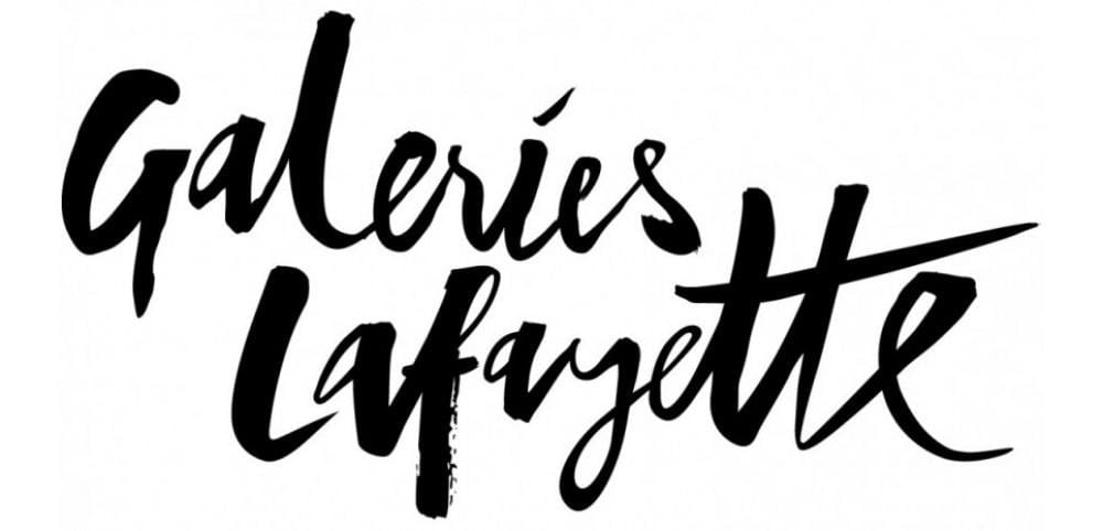
Galeries Lafayette is an upscale French department store. Not only is the typography elegant and fancy, but the Eiffel Tower is hidden in the letter ‘f’, solidifying its French roots.
16. Newman
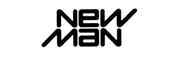
Upon first look, this logo for a French clothing company doesn’t look groundbreaking. But it does have a bit of a visual trick. If you look closely, you can read the logo the exact same way upside down. This implies that the company is innovative and their clothing can serve multiple purposes.
17. Greenlabs

Greenlabs, a digital marketing and web solutions company, uses a tree as their logo. This accentuates the ‘green’ aspect of their brand, but what about the labs? The crown of the tree is actually a brain, which represents the intelligence of their staff.
18. Bird Love
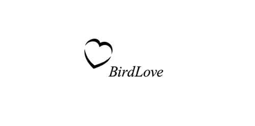
Mike Erickson
This logo for a vietnamese coffee shop is very simple. It’s black and white, the typeface is a classic serif, and the heart symbol is clean. This reflects the integrity of the brand and its dedication to classic vietnamese coffee, as well as their love and passion for it. Hidden away in the heart are two flying birds, bringing in its namesake.
19. Gamecube
![]()
Gamecube’s logo is very interesting to look at, and for good reason. Not only is it a cube within a cube, but the outer cube forms a ‘G’ around the inner cube, leaving a ‘C’ in the negative space.
20. Yoga Australia
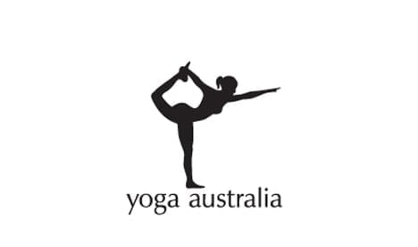
Roy Smith
This logo for Yoga Australia has a hidden gem in its negative space. In the area between the arm and the leg it’s grasping is the geographical outline of Australia.
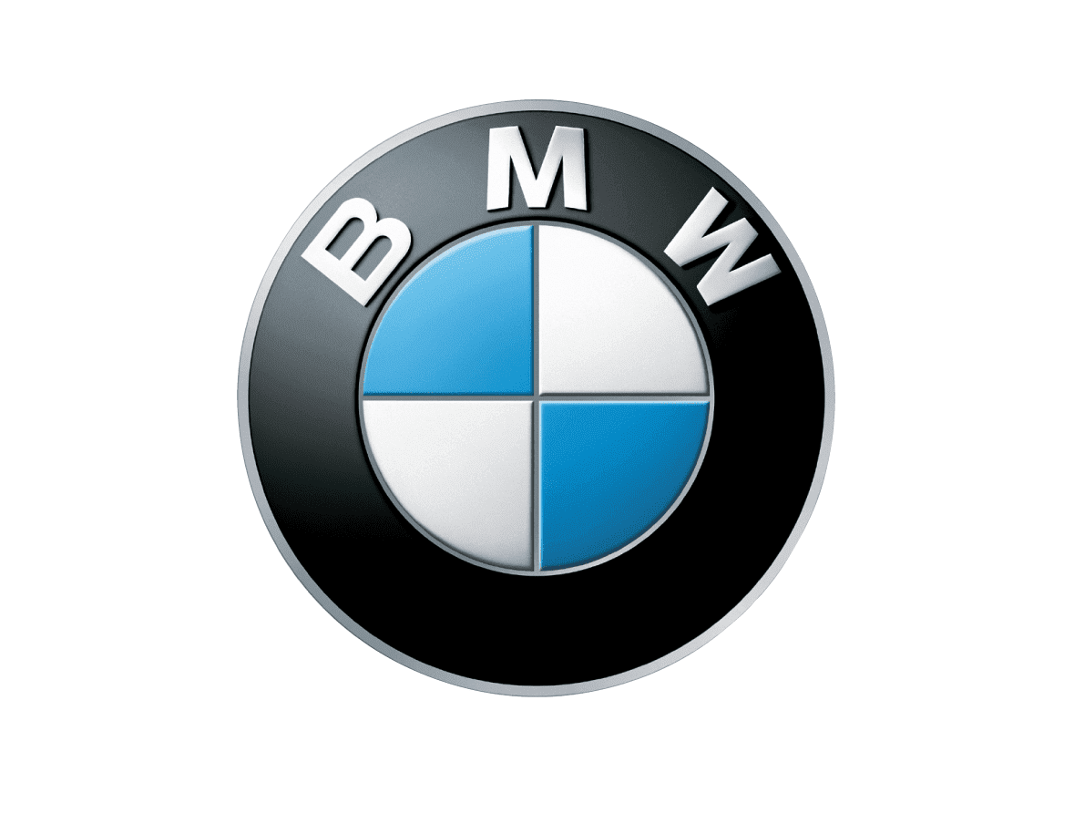
21. BMW
BMW’s logo colors come from the Bavarian flag, which are blue and white. Their logo is derived from the Rapp Motor Works’ logo, which is very similar. It is commonly thought that the logo represents the blades of a spinning propellor, due to their aviation history and an ad created in the 1920s.
22. British Blind Sport

The British Blind Sport charity enables blind and partially sighted people to participate in sports. Their logo features what appears to simply be the British flag, but if you look a bit closer, you’ll see something special. The blank area in the center may seem to have been added in to make the word ‘blind’ easier to read, but in fact, it is acting as the pupil of an eye, with the rest being made up of the contour of the flag.
23. LG

LG is recognized worldwide, and most people recognize the ‘L’ and ‘G’ in the logo mark. What most people don’t realize, though, is that those letters actually help to create a face. The ‘L’ makes the nose and the ‘G’ makes up the rest of the face. This gives the brand a human element, and makes it more inviting and approachable.
24. Lion Bird
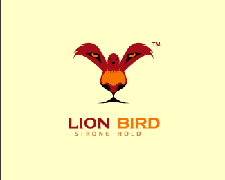
Nashifan
This logo is a mastery of visual manipulation. Do you see a bird first, or a lion? Both are there, though the lion is minimally so. The face is made up with the body of the bird, and your eyes fill in the rest in the negative space. The lion represents the way the brand attacks its profession, and the bird represents their power.
25. The Swan and Mallard
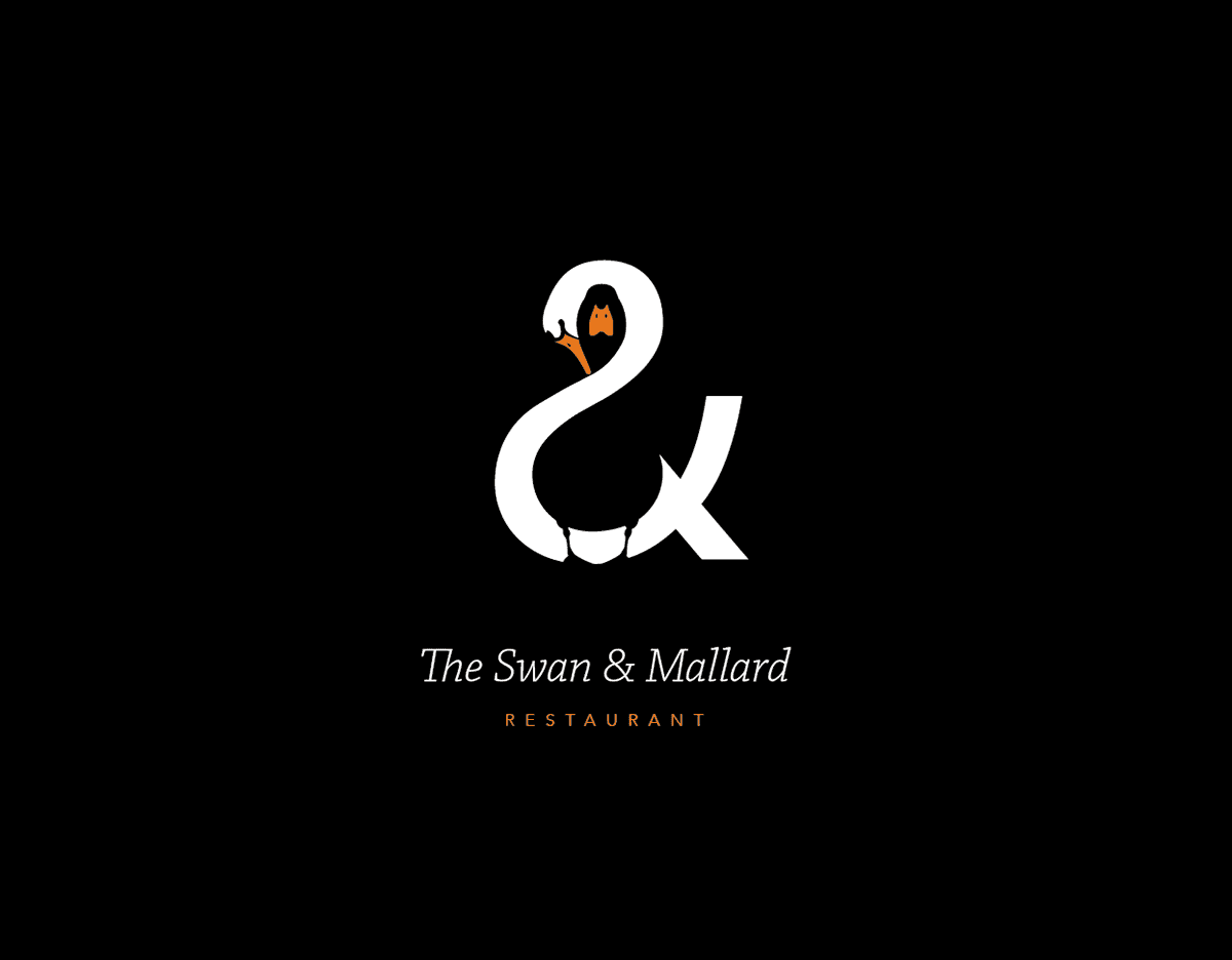
John Randall
The Swan and Mallard restaurant logo takes the idea of visual mastery to another level. Not only is there a black mallard hiding in the negative space of the swan, but the swan forms an ampersand. If the mallard was placed in another area, it wouldn’t have been possible to create the ampersand so cleanly. The logo is clean and elegant, giving you a taste of how your experience would be in the restaurant.
26. Spartan

This logo for the Spartan Golf Club has dual meanings. When you look at it one way, you may see a golfer taking a swing, with his trajectory displayed beside him. When you look at it the other way, you can see the profile of a Spartan in his helmet.
27. FedEx
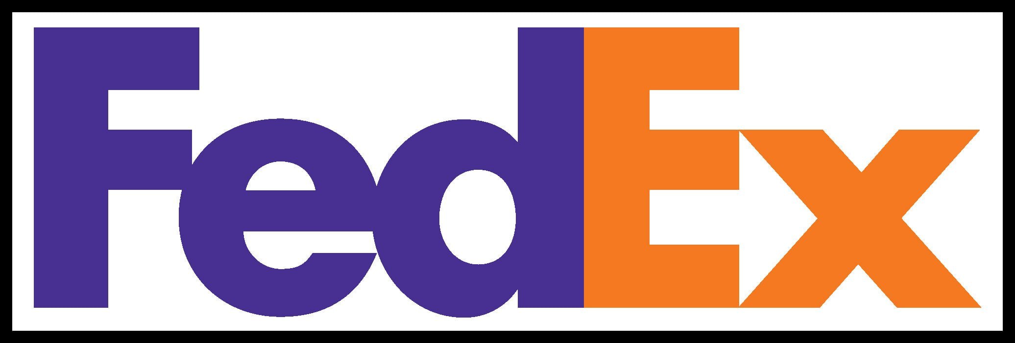
FedEx is an incredibly popular shipping company, and its logo is plastered on trucks and planes all over. While there isn’t anything incredibly groundbreaking in the colors or simple type, there is a hidden gem in there. Have you ever noticed the arrow hidden in the negative space between the ‘E’ and ‘x’? The arrow represents the idea of moving forward with speed and precision, much like the FedEx brand.
28. Schizophrenic
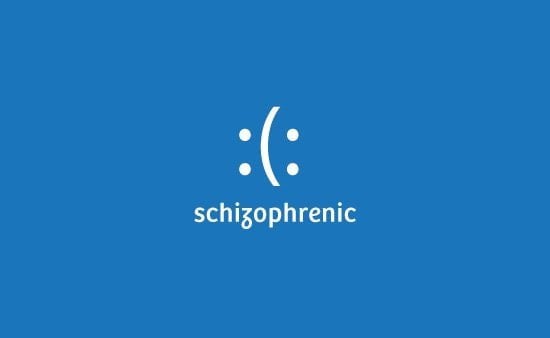
siahdesign
This logo uses emoticons to send a message. When read from the left, a sad face is seen, and when read from the right, a smiling face. They show the struggle of the disease the logo is depicting, and stirs up conversation.
29. Tostitos
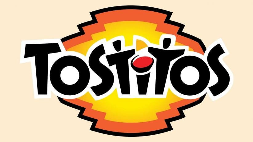
Tostitos, the popular chip and salsa brand, has some fun imagery hidden in its typography. The ‘tit’ in Tostitos is actually two people enjoying chips and salsa at a table, showing that the snack is fun and social.
30. US Cyber Command

For a government organization as important as the United States Cyber Command, having a deeply hidden meaning in its logo is almost expected. Most would probably not even notice it, but hidden in the golden ring is a code: 9ec4c12949a4f31474f299058ce2b22a (no, that’s not gibberish). It was cracked by a threat researcher, and turns out to be the MD5 hash of their mission statement. MD5 is a 128bit cryptographic hash used to verify file integrity. Interested in what their mission statement is?
“USCYBERCOM plans, coordinates, integrates, synchronizes and conducts activities to: direct the operations and defense of specified Department of Defense information networks and; prepare to, and when directed, conduct full spectrum military cyberspace operations in order to enable actions in all domains, ensure US/Allied freedom of action in cyberspace and deny the same to our adversaries.”
31. Carrefour
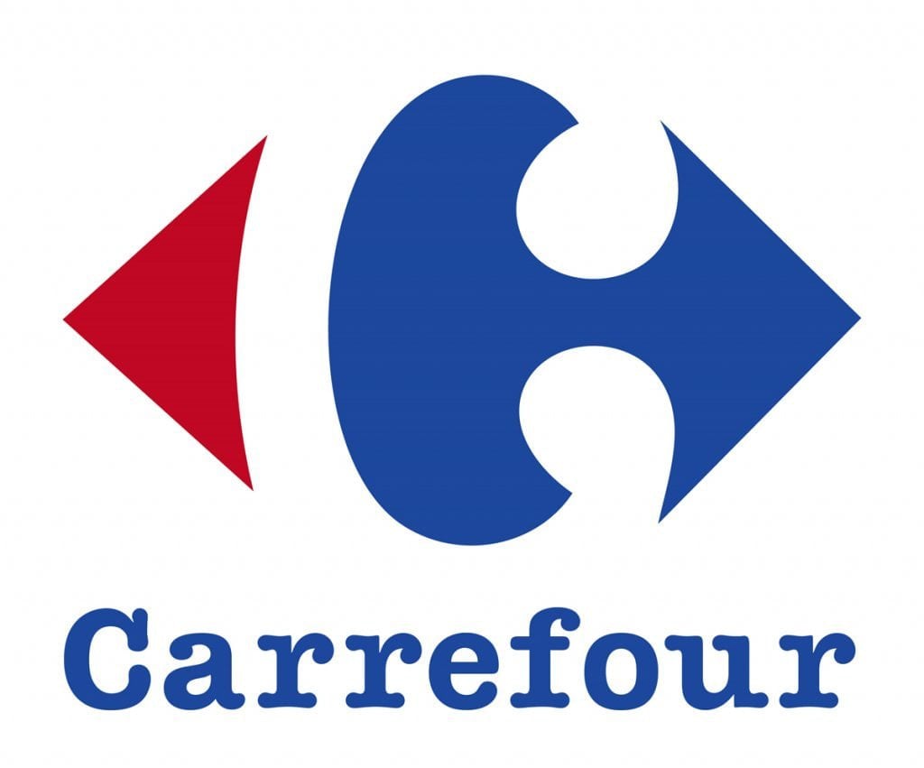
French for ‘crossroads’, the Carrefour logo features two arrows on both the left and right sides. Hidden between the two in the negative space is the letter ‘C’, standing for the brand name.
32. Milwaukee Brewers

This old logo for the Milwaukee Brewers looks like a baseball mit catching a baseball, but it’s not only that. Upon closer inspection, you can see that the letters ‘m’ and ‘b’ are what create the baseball glove.
33. Unilever
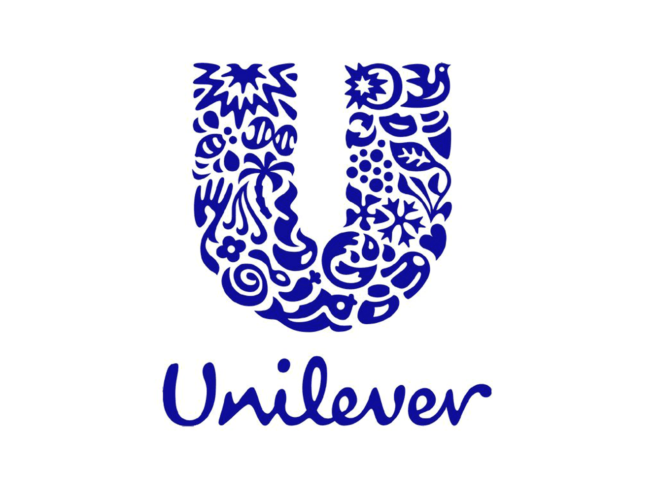
Unilever makes a ton of products, and to showcase that they created a ‘U’ out of a variety of icons symbolizing some of their core products. It’s a fun way to show they have their hands in a variety of areas, and gives the viewer something to piece together.
34. Sun Microsystems
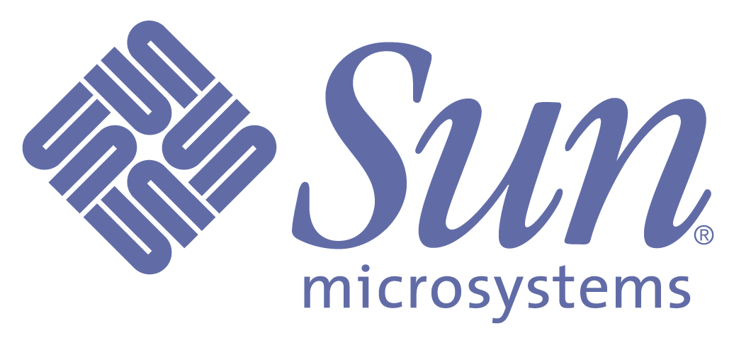
Sun Microsystems was a technological company. The diamond shaped logo isn’t just a bunch of squiggly lines but is actually comprised of ‘u’s and ‘n’s. Some of the letters are stacked on top of each other, creating the letter ‘s’. All of this put together spells out ‘sun’ over and over.
35. Pittsburgh Zoo PPG Aquarium
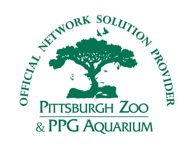
This zoo logo looks like a simple tree at first glance. If you look in the negative space, though, you’ll see the profiles of both a gorilla and a lion facing each other. This helps to showcase the wildlife that can be seen at the zoo.
36. Toblerone
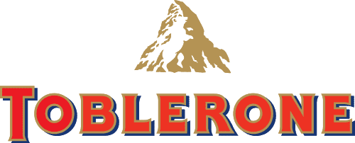
The popular chocolate bar, Toblerone, has been around for quite some time. It’s current logo features a mountain, symbolizing the Matterhorn Mountain in Switzerland. Hidden inside the mountain is a bear, symbolizing the unique honey flavor found in the chocolate and the fact that the chocolate is made in the ‘City of Bears’.
37. Toyota
![]()
Toyota’s current logo has been around since 1990. The popular car manufacturer’s three overlapping rings symbolize the unification of the hearts of Toyota customers and Toyota’s products. The background space represents their technological advancement and the opportunities that lay ahead.
38. Audi
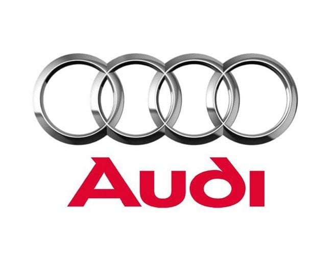
Another car company with a logo with a hidden meaning is Audi. The four rings represent the four companies that came together to create the original Audi, Auto Union.
39. Continental
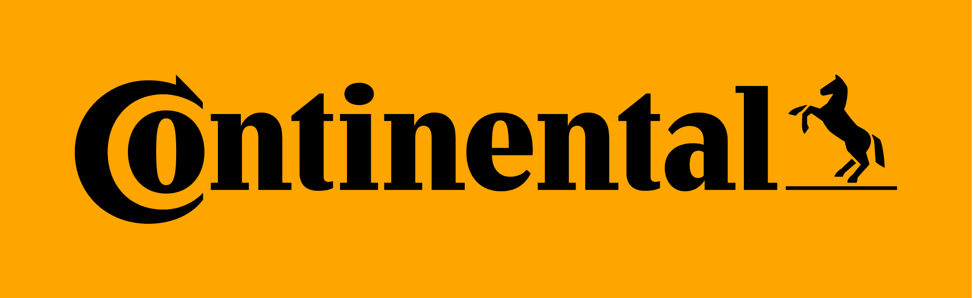
Hidden inside Continental Tire’s logo is none other than a tire. The ‘C’ and the ‘o’ are closely placed together, with the ‘C’ wrapping around it, creating the shape of a tire.
40. Apple
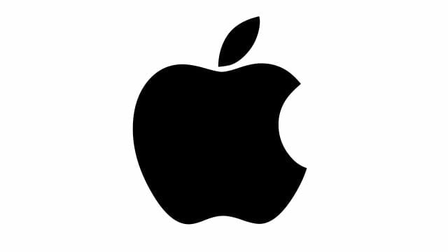
One of the most recognizable logos in the world, the Apple logo is theorized to have come from none other than the story of Adam and Eve. The apple is supposed to be the apple Eve bit from in the bible and represents the fruits from the Tree of Knowledge.
41. Google
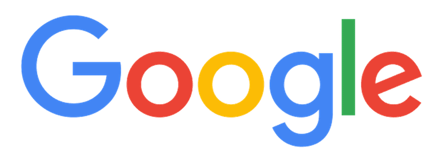
Another incredibly recognizable logo worldwide (even after their recent redesign), Google’s logo is supposed to symbolize that they don’t play by the rules and know how to have fun. Instead of having a crazy font or symbol, they chose to relay their message with color. They stuck with the primary color palette but broke it with a secondary color, green.
42. The Outstanding Website Company
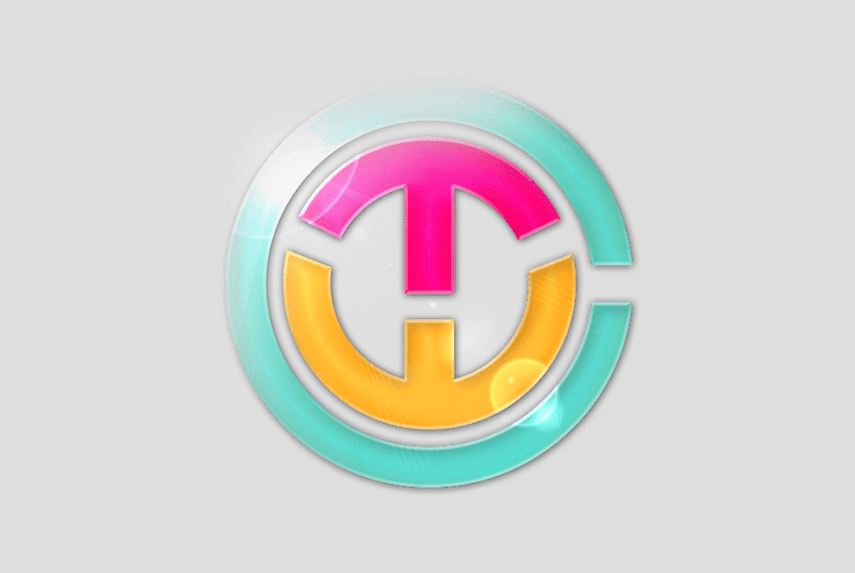
This logo is a trick with typography. Hidden inside the two circles are the initials of the company, each shown in a different color. This shows how playful and energetic the company is, and goes with their overall brand image.
43. Washington State University
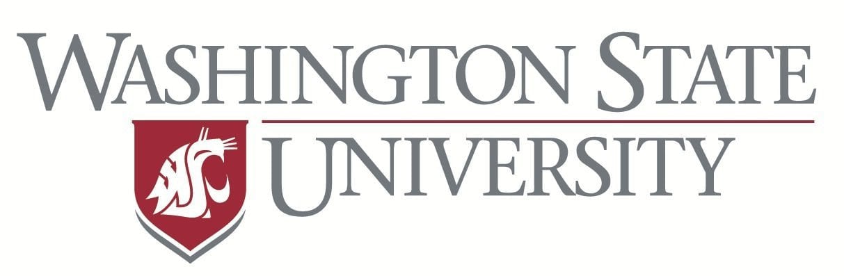
Washington State University’s mascot is a cougar, which is their logo mark. Subtly hidden in the cougar’s head is the university’s initials, W, S, and U.
44. Gillette
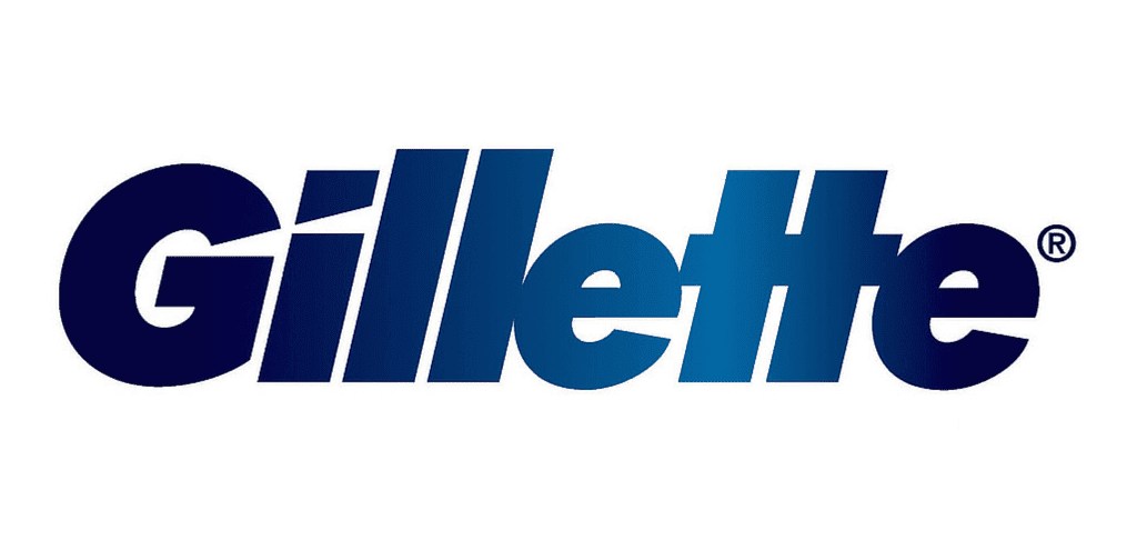
Gillette, a razor company, is razor sharp with their logo — literally. The intricate and precise cut in the ‘G’ and ‘i’ look as though they’ve been carefully removed with an extra sharp Gillette razor.
45. Pinterest
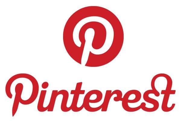
Pinterest got its namesake from the idea of ‘pinning’ things you like to a board. To further the idea of the pin, the ‘P’ represents a pushpin. This brings together the real life aspect of tacking something to your wall and also doing it in the digital age.
46. Adidas

Adidas is a popular sports apparel and shoe company. Three stripes have always been a part of their logo, but in their most recent redesign, the stripes are staggered to look like a mountain. The mountain represents the challenges and obstacles athletes will face and overcome.
47. Atlanta Falcons
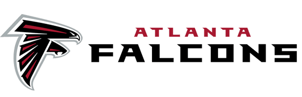
It’s relatively commonplace for sports teams to have animals as mascots, and therefore their logos. The Atlanta Falcons are no exception. As you can see, their logo is a falcon, but the shape of the falcon was carefully considered. The falcon is in the shape of an ‘F’, representing the Falcons in more than one way.
48. Kolner Zoo

The Kolner Zoo in Germany’s logo has a number of hidden symbols. In the contours of the elephant is a giraffe and a rhino, for starters. Hidden in the back legs of the elephant is the Cologne Cathedral, a famous local landmark.
49. IBM
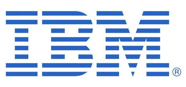
IBM’s famous logo is globally recognized. The white stripes passing through the letterforms give the illusion of equal signs in the lower areas of the letters, which represents equality.
50. Hope for African Children Initiative
At first glance, this logo appears to simply be the geographical outline of Africa. If you look more closely, you can see that this outline is actually created by the contours of two people – an adult and a child.
There you have it, incredible meanings behind 50 incredible logos. How many of them were you aware of, and how many took you by surprise?