Brand Logos: 19 logo examples of Inspiration
When it comes to your business’ branding strategy, establishing a logo is one of the most critical tasks.
![]()
Your logo will be pervasive throughout your marketing campaigns, and it’s one of the most prominent branding elements people will think of when someone mentions your company.
Mounting research backs up how important a logo can be to your brand. In fact, a recent study from the Journal of Marketing Research found that an effectively designed logo can “influence brand evaluations, purchase intentions, and brand performance.”
Not sure what it takes to create a killer brand logo? To give you a better idea, check out our list of stand-out logos below.
1. Geometric Logos
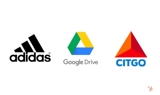
Geometric shapes are highly effective at creating stylish and fun designs. Some can even evoke feelings of movement. It’s particularly popular amongst big brands from Google to Adidas — also proving that you don’t need to belong to a specific industry to use it. The final result is often a clean and modern design.
2. Negative Space Logos
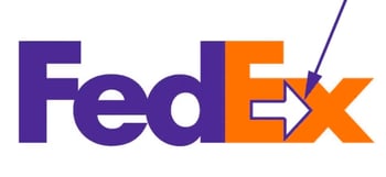
Negative space logos are all about leveraging what you don’t see. Because these logos take more thought to execute, you can typically spot subtle meanings. For instance, you may see hidden letters, icons, or names. A great example is the FedEx logo which uses negative space to create an arrow between the “e” and “x” letters.
You don’t have to be super obvious with your negative space. Often, these logos use it to add small details that complement the main visual.
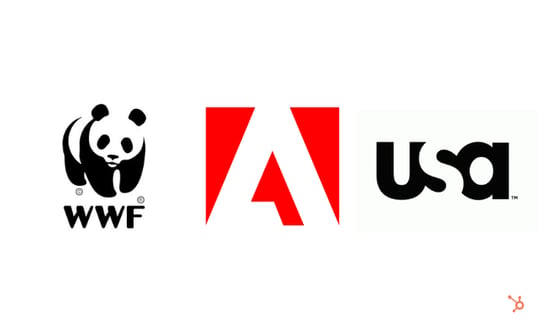
3. Typography-Based Logos
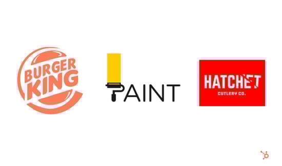
Typography can add a clever spin on traditional logos. We often see two varieties — one where typography enhances the imagery (see Hatchet), and the other where typography is incorporated within the imagery, giving it structure (see Burger King).
In the examples above, we see the text and graphics working in harmony — in other words, you can’t have one without the other.
4. Hand-Drawn Logos
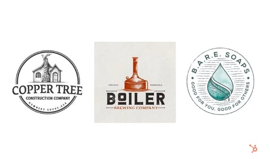
Hand-drawn logos feel similar to a personal signature. It gives brands an authentic, rustic, down-to-earth, and even child-like feeling. Most incorporate a sketch of a scene, object, idea, or symbol. Because no two hand-drawn designs are alike, this style almost guarantees a unique and original logo.
5. Overlapping Logos
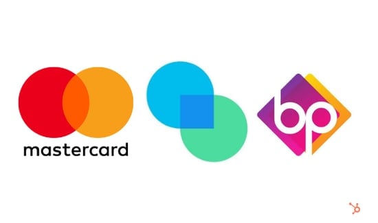
By using multiple layers, you can create more complex and colorful logos without overwhelming the viewer. It’s an effective strategy that “interrupts” visual elements — or even text — within a design. That said, these logos can be hard to pull off without a designer, so we recommend leaving this trend to the professionals.
Logo Examples in Ads
6. McDonald’s
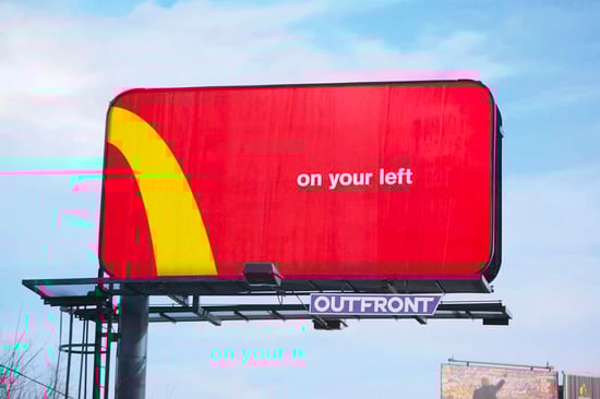
McDonald’s “Follow the Arches” campaign highlights the power of logos — even if you can’t see all of it.
It features a portion of its golden arches logo along with a simple line of text — such as “On your left” and “On your right.” With the creative use of its logo and signature colors, consumers instantly recognize the brand — and know that it’s just around the corner.
7. Curtis
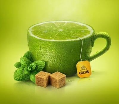
Curtis brings the smell and taste of fruit to life. Add the steam on top, and your mouth begins to water. The yellow logo on the tea label also brings a nice contrast to an otherwise monotone color scheme.
8. Nescafé
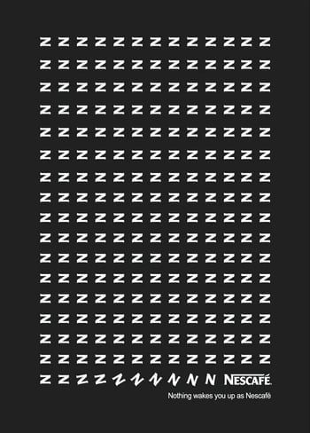
This black-and-white ad for Nescafé features rows and rows of zig-zags. It seems confusing at first, until you read the tagline, “Nothing wakes you up as Nescafé.”
Suddenly, these zig-zags become Z’s to represent sleep, and they eventually “wake up” and transform into the Nescafé logo. It’s a playful ad that uses symbols to illustrate the relationship between sleep and coffee.
__
Source: hubspot.com