Google Logo History
In 1997, Larry Page designed an early digital version of the Google logo using GIMP, a free graphics software. He modified the typeface and added an exclamation mark, taking inspiration from the Yahoo! logo.

Initial Google logo from September 15, 1997 to September 27, 1998
Graphic designer Ruth Kedar, who finalized the iconic logo in May 1999, recalled, “We explored countless color variations.” She explained, “Ultimately, we settled on primary colors, but rather than following a predictable sequence, we chose a secondary color for the ‘L’ to reflect Google’s unconventional spirit.” Kedar selected the Catull font, noting, “I wanted something that blended the elegance of classic typography with a modern, unexpected twist. The font’s refined stems, ascenders, descenders, and precise serifs gave it a fresh yet timeless feel—something unmistakably new at first glance.”

Original logo in the Baskerville Bold typeface, used from September 28, 1998 to October 29, 1998. It uses a different color combination from the one in use today, with the initial “G” being colored green.

The logo used from October 30, 1998 to May 30, 1999, differs from the previous version with an exclamation mark added to the end, an increased shadow, letters more rounded, and different letter hues. Note that the color of the initial G changed from green to blue. This color sequence is still used today, although with different hues and font.

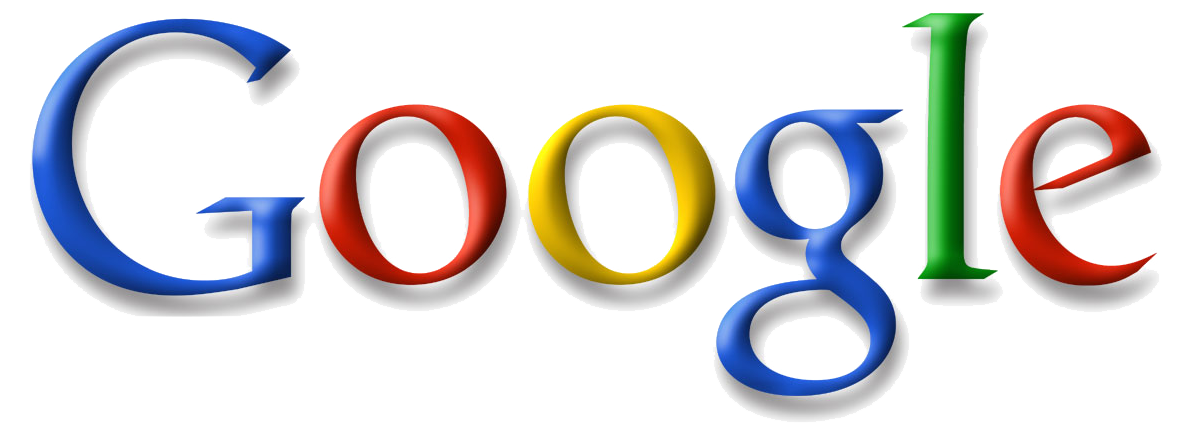
The company logo changed to one based on the Catull typeface and was used from May 31, 1999 to May 5, 2010. The exclamation mark was removed, and it remained the basis for the logo until August 31, 2015.
The logo underwent its first significant redesign in 2010, marking a shift from its May 31, 1999 version. Previewed on November 8, 2009, and officially unveiled on May 6, 2010, the updated design retained the same typeface but introduced a brighter, more orange-hued ‘o’ (replacing the earlier yellowish tone) and a subtler shadow with a refined shading technique.

The logo used from May 6, 2010 to September 18, 2013, showing a reduced distance of the projected shadow, a change in the second “o” to a different yellow hue and a more flattened lettering
On September 19, 2013, Google debuted a “flat,” two-dimensional logo with a slightly adjusted color scheme. The 2010 version lingered on certain pages, like the Google Doodles section, for some time. A minor tweak followed on May 24, 2014, with the second ‘g’ shifted one pixel right and the ‘l’ nudged down and right by one pixel.

The logo used from September 19, 2013 to August 31, 2015, showing flattened lettering and the removal of shadows
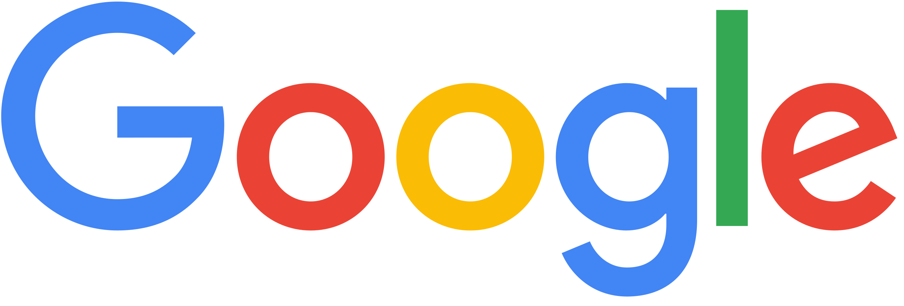
A bold overhaul arrived on September 1, 2015, when Google launched a “new logo and identity family” optimized for multi-device use, sparking some debate. The most striking change was the switch to Product Sans, a sleek, geometric sans-serif typeface developed in-house at Google (also used for the Alphabet logo). While the colors remained consistent with the prior design, the modern typography signaled a new chapter for the brand.

The logo used since September 1, 2015, featuring a new typeface, Product Sans. The colors remain unchanged from the previous logo.