Premier League Logos and Their History
Since the league’s inception, Premier League logos have constantly evolved according to ever-changing design preferences. Still, most of them carry a constant element as a sign of the team’s heritage or local history.
Premier League logo
Be it the local references or coat of arms in the team logos, these aren’t just symbols. These icons are representative of an entire sporting history and will carry each team’s name forward into the future.
These logos serve an essential purpose of not only differentiating two teams but also of generating a sense of emotional attachment between the fans and the team they support.
Here are all of the English Premier League logos in alphabetical order and their backstory!
Arsenal
Arsenal has been established since 1886
The third most successful English football club is Arsenal. The ever-present club holds many records, such as having a total of 13 league titles and having the longest unbeaten run of all time, which they achieved in 2004. Arsenal has also bagged 14 F.A. cup trophies.
The logo’s crest comes with a shield shape emblem and has its colors depicted throughout. The name “Arsenal” is written in white, and the canon on the logo is from their association with their Woolwich roots when the club first came into being in the 1800s. Back then they were known as ‘Woolwich Arsenal’ and were located in Woolwich, in South-East London, a place tied to the ‘Royal Arsenal‘.
[ Download Arsenal vector logo ]
Aston Villa
Aston Villa has been established since 1874
Aston Villa football club, based in Aston in Birmingham, was founded in 1874. Since then, Villa has won the league title on 7 occasions.
The star featured on the Club’s logo represents the team winning the European Cup in 1982, where they managed to beat German giants Bayern Munich. The logo reads “AVFC”. Interestingly, despite competing in the English Premier League, the lion on the logo is actually associated with the Scottish coat of arms. William Mcgregor, a former, and first, president of the club made this change as a nod to the Scottish community within the local area.
[ Download Aston Villa logo vector ]
Bournemouth F.C.
Boscombe, now AFC Bournemouth has been established since 1899
The club was first introduced to British football as ‘Boscombe” in 1899 and later became AFC Bournemouth in 1971. The team is commonly referred to as “The Cherries” by its fans.
The circular emblem features the home colors of red and black. The current edition of the logo was actually used for ten years between 1971 and 1981 and was later reintroduced. The visual we see is actually computer generated, depicting a player heading a football. This player was in fact Dicky Dowsett, who played a massive role in their transition from Boscombe to AFC Bournemouth.
[ Bournemouth FC logo vector ]
Brentford
Brentford has been established since 1889
More popularly known as “The Bees,” the club was founded in 1889. The logo features a red circular badge containing the club name. The circular shape of the logo is reminiscent of many other teams within the league.
Brentford‘s nickname is referenced by featuring a bee in the logo. The current logo was only introduced recently as a replacement for their old emblem that had been used since 1993. Like many clubs, innovation in branding is essential to progress.
[ Download Brentford logo vector ]
Brighton Hove Albion
Brighton Hove Albion have been established since 1901
Brighton Hove Albion Football Club is known to many by its nickname “The Seagulls” and was founded in 1901. When compared with other team logos, it is somewhat minimalistic. It is in ways close to the approach taken by Brentford.
At the center of the emblem, there’s an image of a flying seagull that references Brighton’s connection with the south coast of England.
[ Download Brighton Hove Albion logo vector ]
Chelsea
Chelsea have been established since 1905
One of the most popular English Premier League teams is Chelsea. The club came into existence in 1905.
The original logo contained a man wearing military dress, based on the Chelsea Pensioners. It wasn’t until 1953 that the lion was introduced.
Over the years, the emblem has been modified to appear more modern, but ultimately still contains many of the same elements.
[ Download Chelsea logo vector ]
Crystal Palace
Crystal Palace have been established since 1861
Crystal Palace Football Club features a swooping eagle and has an unforgettable emblem. The nickname, “The Eagles” is fundamental to their history, and hence, it features one as the main centerpiece.
The logo also uses an image of a palace that depicts the Crystal Palace Exhibition building that was famous within the local area in South London.
[ Download Crystal Palace logo ]
Everton
Everton have been established since 1878
Established in 1878, Everton has one of the most traditional-looking emblems. The club logo references the Everton Lock-Up in the middle of the Everton district- a building linked to the local area since the 1700s.
The logo features the name of the club and its motto, “Nothing but the best is good enough.”
[ Download Everton logo vector ]
Fulham
Fulham have been established since 1879
Fulham football club is based in London and was founded in 1879. They now play in the English Premier League after spending periods of time between the Championship and the top tier.
The “Cottagers” and the “Whites” are nicknames for Fulham Football Club among its supporters. The fact that their home colors contain a lot of white may be the origin of the name “Whites.” The logo is straightforward and features a black-and-white striped shield.
[ Download Fulham logo vector ]
Leeds United
Leeds United have been established since 1919
Leeds United isn’t as old as other teams in the league. Founded in 1919, the club is based in Leeds, West Yorkshire.
The logo has “LUFC” on the blue and yellow shield. The logo depicts the white rose of York, and the design of the logo is derived from the Leeds coat of arms.
[ Download Leeds United logo vector ]
Leicester City
Leicester City have been established since 1884
Leicester City, founded in 1884, features its official mascot, a fox, in its logo—the current logo has both a simple and modern touch. The name of the club is written in a matching blue shade and has a blue circular badge.
[ Download Leicester City logo ]
Liverpool
Liverpool FC have been established since 1892
The Liverpool logo is probably one of those that stand out amongst all due to its uniqueness.
As time passed, the image changed, and now it features a graceful red bird placed inside of a bold shield emblem.
“Eternal flames” can be seen rising on both sides of the shield, and the club formation date can be seen at the bottom of the shield. An extra dose of inspiration for fans is the phrase “You’ll never walk alone” which can be seen on the top of the shield.
[ Download Liverpool FC logo vector ]
Manchester City
Manchester City have been established since 1880
Formerly “St Mark’s” football club in 1880, Manchester City was formed in 1894 and is one of the most well-known clubs globally.
The current badge has a shield in the middle with a circular emblem. The white border around the shield contains the name of the football club, and the inner shield has a picture of the red rose of Lancashire and a golden ship.
[ Download Manchester City FC logo vector ]
Manchester United
Manchester United have been established since 1878
Manchester United is based in the Old Trafford region of Greater Manchester. The club was initially founded in 1878 under the name Newton Heath.
The logo comes from the City of Manchester coat of arms. One of the main elements that remain since the beginning is the ship in sail. The devil in the center of the logo comes from the club nickname the ‘Red Devils’.
[ Download Manchester United logo ]
Newcastle United
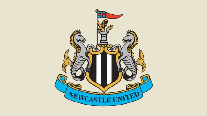
Newcastle United have been established since 1892
Newcastle United has been an integral part of the English League for many years. The club was established in 1892. Over the years, the club has won four league titles and six F.A. cups.
The 14th-century Newcastle upon Tyne’s Coat of Arms is implemented in the Newcastle United emblem. The seahorses are included to show respect to the coastal, seafaring culture that has been part of the Newcastle area for many generations.
[ Download Newcastle United logo vector ]
Nottingham Forest
Nottingham Forest have been established since 1865
Nottingham Forest can be crowned as the oldest club in the league, after being established in 1865. They have a significant history and have even managed to win multiple European Cups.
The team, known as “The Tricky Trees” or “Forest,” currently competes in the Premier League after spending many years in the lower divisions.
The logo is simple and represents their ‘Forest’ nickname by featuring a tree.
[ Download Nottingham Forest logo ]
Southampton
Southampton have been established since 1885
The club logo features an attractive, intricate, and bright emblem that catches the viewer’s attention. The logo features the Southampton coat of arms and football scarf, and the name of the club can be seen at the foot of the crest.
The golden halo at the top of the logo represents “The Saints”, a nickname that came from their association with the St Marys Church. Fittingly, their stadium also carries the same name. The tree in the middle of the crest is symbolic of the New Forest, an area of woodland close to the City of Southampton. To top it all off, waves are included due to the proximity to the coast.
Tottenham Hotspur
Tottenham Hotspur have been established since 1882
Tottenham Hotspur, formed in 1882 and based in Tottenham, North London, possesses a logo featuring a cockerel that stands on the top of a football.
This cockerel is said to have been included as a nod to fighting cockerels, as a way to portray the club’s ‘to dare is to do’ attitude.
The name of the club can also be seen underneath the central image.
[ Tottenham Hotspur logo vector ]
West Ham United
West Ham United have been established since 1895
West Ham United, based in Stratford, East London, was originally established as Thames Ironworks in 1895.
The team’s crest has been derived from the Union Flag of the Thames Ironworks. It is widely accepted that the golden hammers in the logo take inspiration from the team’s nickname, “The Hammers.” These hammers are Rivet Hammers, used primarily when building ships. The hammers cover a representation of the Anne Boleyn Tower. This is supposed to symbolize Green Street House, a Tudor building nearby to the old Boleyn Ground.
Like other EPL logos, the shield-shaped team emblem helps maintain a sense of heritage.
[ West Ham United logo vector ]
Wolverhampton Wanderers
Wolverhampton Wanderers have been established since 1877
Another unique logo on the list, the Wolverhampton Wanderers emblem, looks completely different from all the other logos in the league.
Known as the “Wolves,” the club was founded in 1877, and it currently uses an image of a wolf’s face on a hexagon-shaped background as its logo.
The colors in the logo, reference the city council motto of “out of darkness cometh light.”
[ Download Wolverhampton Wanderers logo vector ]
Related: