Wordmark Logo Design: A Beginner’s Guide
Wordmark logo design is all about keeping it simple. The type-only look is a popular (and timeless) choice across industries, especially tech, media, fashion, and food.
Wondering if a wordmark logo is for you? We’ll cover how to design your own as well as tons of wordmark logo examples for inspiration.
What is a wordmark logo?
It’s a type of logo design that includes only the company name — no symbols, mascots, or badges. Wordmark logos are also called “logotypes,” and can include monogram logo variations for smaller spaces like social media profiles and favicons. Because of the simplicity of these logos, typography and spacing are extra important.
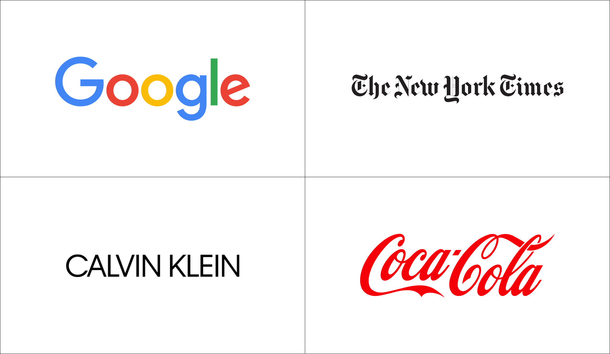
Examples of famous wordmark logos include Google, Coca-Cola, and Calvin Klein. In these cases, the words have become the visual landmark of the brand identity.
Ian Paget, a U.K.-based graphic designer and founder of Logo Geek said “When we’re born, letters and fonts are just shapes, but as we grow we begin to associate the shapes to words, and the design of those words to specific objects and organizations,”
“For example, if I asked anyone to choose an appropriate font for the word ‘Army,’ most of us will picture a heavy stencil typeface, and we would most likely color it in dark green, too.”
Paget says that if you understand your target audience, you can take advantage of these cultural and visual associations to communicate specific messages through the use of font and logo color combinations.
When to choose a wordmark logo
While many designers favor wordmarks (also called logotypes) and consider them the most “pure” form of a logo, creating a wordmark when you’re not a designer can be intimidating.
You don’t want your logo to be boring or forgettable. And when you’re starting a business, you may need help communicating what you offer, which is difficult without the visual aid of a logo symbol.
“A lot of the most popular companies have logos that include a symbol, such as Nike, Apple, or McDonald’s. Because of that, I feel that business owners expect a logo to include a symbol,” says Paget.
“A symbol can also have more perceived value to a non-designer, as it feels like more time and energy went into the design.”
Still, Paget adds, a well-designed wordmark is the ideal solution for some businesses. Here are strong cases for choosing this type of logo:
- You have a short, distinctive business name — one word is ideal. A wordmark helps establish name recognition, a must in the startup world. If your business name is longer or contains multiple words, consider a monogram or lettermark (think HBO or IBM).
- You’re planning to use your logo across many different mediums, or on top of images and different backgrounds. A wordmark logo is easier to integrate across multiple platforms because you don’t have to worry about the legibility of a symbol or the real estate it takes up — and you don’t have to worry about multiple variations.
- You want to use a bright, distinctive color or typeface in your logo. A strong wordmark doesn’t need other elements competing with it or taking away from its impact.
Read on for a few tips and ideas for creating a wordmark logo that stands out.
How to design a wordmark logo
Lets dive into 5 ways you can design a wordmark logo that stands out.
1. Find the right typeface
Because wordmarks are built using only letters, choosing a typeface that communicates your brand personality is critical. As Michael Evamy writes in his book, Logo, “Words carry meaning; typefaces convey character.”
![]()
To start the process of choosing a logo font, think of a few adjectives to describe your brand personality, such as “helpful” and “environment-focused.” Then start looking at font families and typefaces to see if they fit with those adjectives.
- A script font won’t make sense if you’re running a life insurance company, but it could work well for personal branding or for artisanal or luxury businesses.
- A serif font wouldn’t work for a children’s summer camp, but it might work well for sophisticated brands within traditional industries.
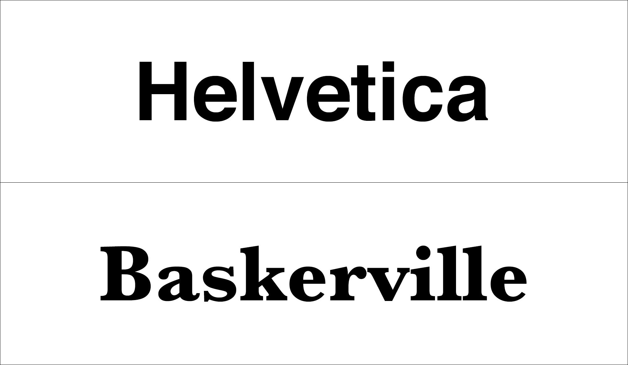
- Sans-serif fonts are on the modern side with no strokes on characters; making them great for branding in tech, law, consulting or architectural industries.
Check out the difference between Helvetica, a sans-serif, and Baskerville, a serif font below!
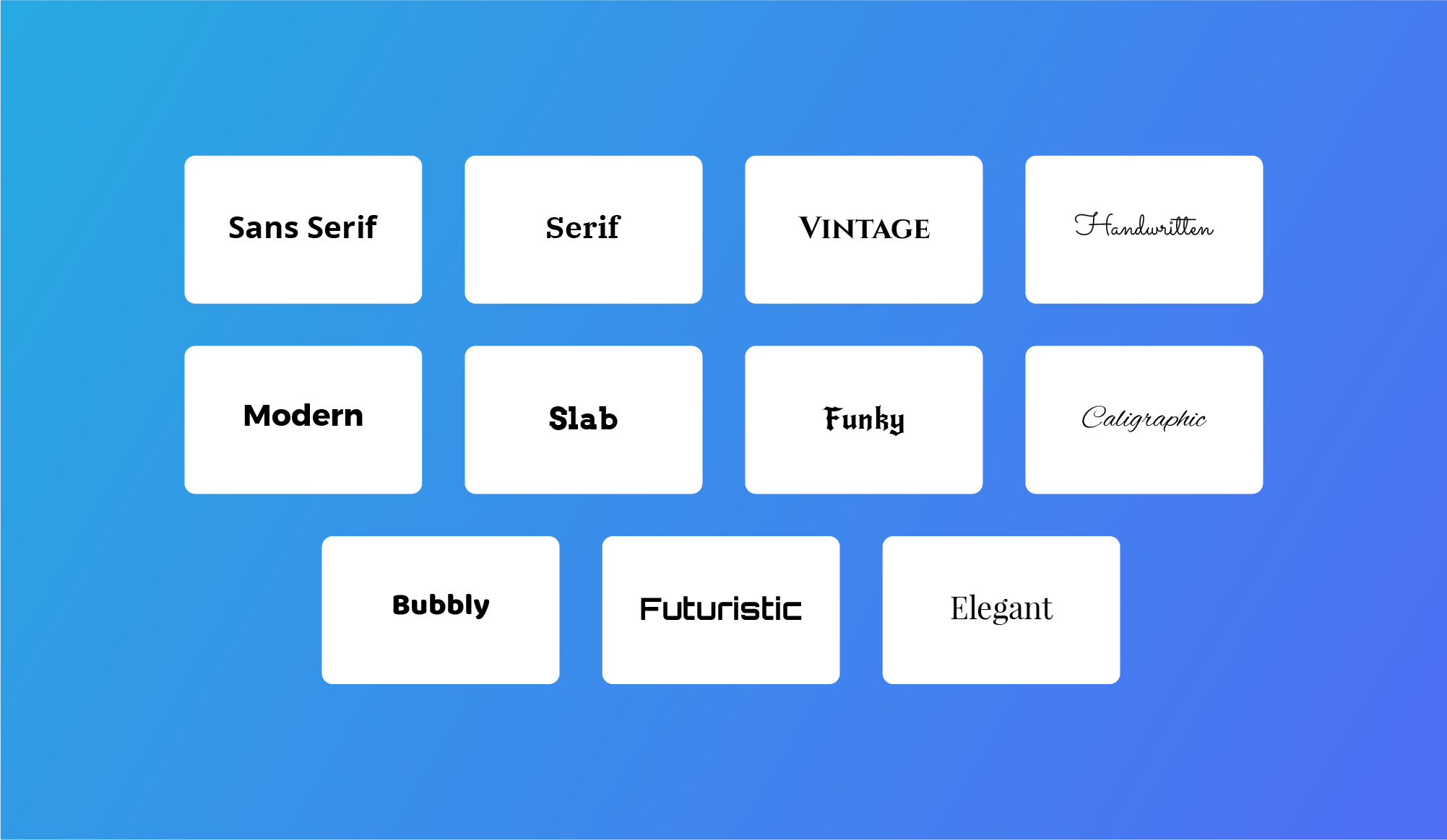
Beyond serif and sans serif fonts, there’s a vast range of font groupings. For example, here’s how we categorize fonts at Looka:
As with any logo style, you also want to pick a typeface that ensures your company name is legible in different sizes and across different channels. To do this, consider:
- Weight – Is your typeface thick or thin? Solid or textured?
- Case – How does your typeface look in uppercase or lowercase letters?
- Features – Does your typeface have distinct features like notches or curves?
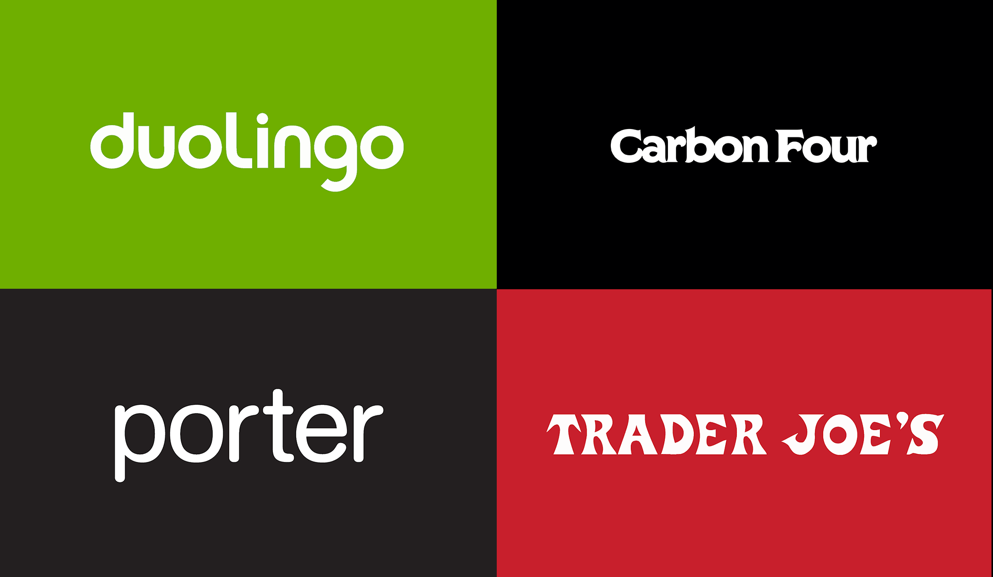
Here are a few monogram logo examples of standout typefaces:
Pro Tip: “Being aware of competitors’ logos allows you to ensure a typeface is selected that’s not currently being used in the market. Just make sure that the chosen font has the correct associations with your business and brand — don’t be different for the sake of being different. Modifying a typeface, or having one designed from scratch, can also allow you to have a very distinct wordmark that stands out from the crowd.” – Ian Paget
2. Use a character feature
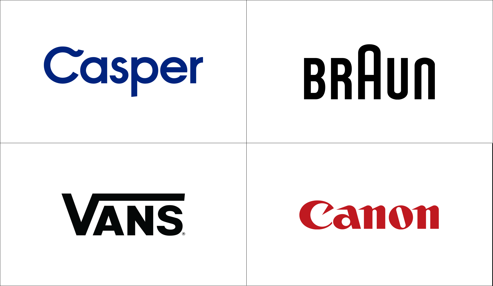
Sometimes the only thing standing between a “regular” typeface and an eye-catching one is a single character that looks different from the rest. That element of surprise adds to a logo’s memorability — think of the swoosh in the “C” of the Casper logo or the exaggerated “A” in the Braun logo.
While character features don’t work in every case, they can be a fun design element to explore and help you get over the fear of text being boring.
Some typefaces, whether custom or existing, have character features on certain letters — for example, extended ligatures, diagonal notches, or other embellishments (as seen on the “o” below).
If you do opt for a character feature, make sure you’re doing it for a reason — will you use that letter as your monogram? Does it add emphasis to your company name in the right spot?
3. Communicate with color
When text is the main attraction in a logo, color is a great way to differentiate your brand and draw the eye in.
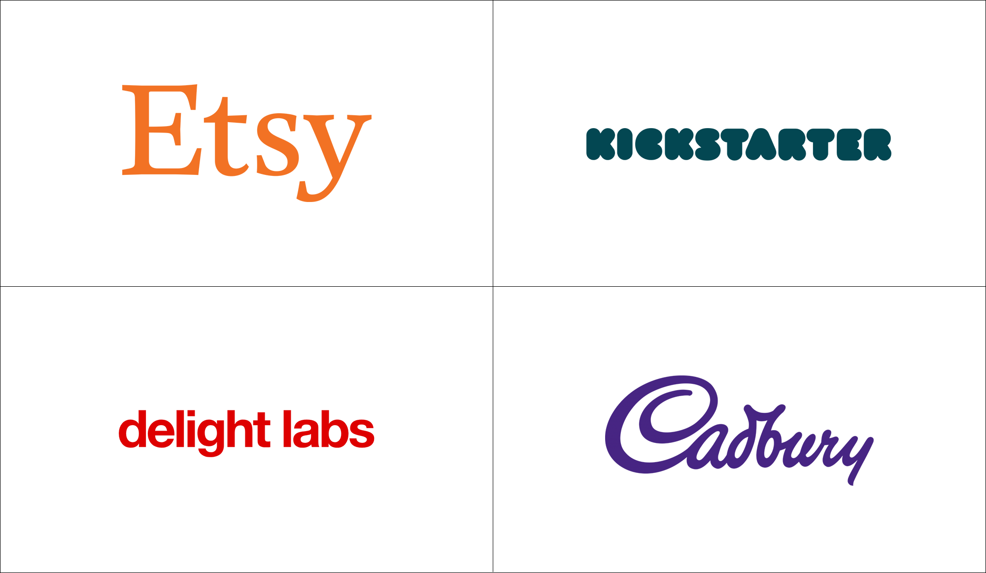
Think of the cheerful-yet-subdued orange of Etsy, the dark turquoise of the redesigned Kickstarter logo, and the royal purple of Cadbury.
Sometimes choosing a minimalist font with a bold color makes everything fall into place (see: Delight Labs).
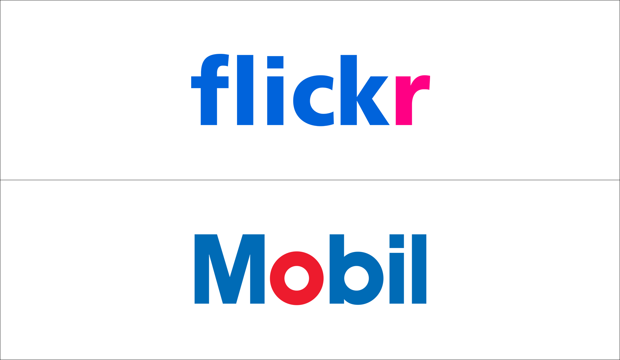
You can also experiment with color by making one character (or one word within a company name) a different color. Flickr does this with a hot pink “r” and Mobil makes a statement with a red “o.”
As with character features, make sure you’re putting emphasis on a letter that makes sense in your company name. Done right, this tactic can be a great way to give your logo identity, especially if you’re using a common logo color like blue.
Designing a white wordmark on a colored background? Remember that your logo will be placed on a white background for many branding applications. To ensure your wordmark looks good everywhere, you’ll need reverse color variations of your logo. (Note: Looka provides these files in our Premium and Enterprise packages.)
Pro Tip: “Color is one of the most identifiable components of a visual identity. If no competitors are using a specific color that’s relevant to your brand, it’s a color that you can own as a business, which would immediately allow you to stand out from the crowd with little effort.” – Ian Paget
4. Get detailed with spacing and letter casing
If you’re designing a wordmark logo (with our logo maker, for example) it’s time to get extra picky about spacing — or, more accurately, kerning, which is the spacing between each letter in your logo.
The kerning you choose will largely depend on the typeface in your logo:
- Do you want some or all of your letters touching?
- Does adding or reducing the space between letters increase the readability of your logo?
- How does the weight and angle of your font affect the spacing?
You can also play around with letter casing to see what best characterizes your brand. Go back to the adjectives you wrote down to describe your business to see what fits.
While title case is the most common, many famous brands make a case (pardon the pun!) for using all lowercase or uppercase letters.
Also, keep in mind that wordmark logos technically don’t have slogans. If you want one, make sure it’s short and one word.
Pro Tip: “A great wordmark is the combination of a carefully selected font (or a designed set of letters) that leverages [cultural and visual associations], while also being carefully kerned.” – Ian Paget
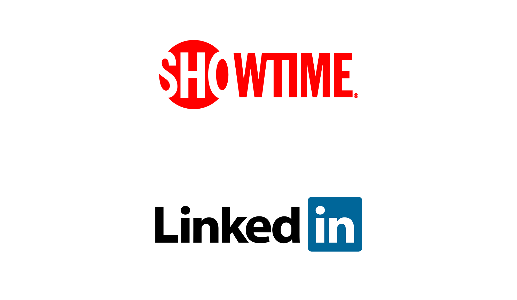
5. Play with shape
Another way that designers add visual interest to wordmarks is to use logo shapes.
Showtime puts the first three letters of its name –“SHO” — in a red circle and reverses the color from the rest of the logo, giving it a whole different look than if there was no shape.
Although LinkedIn is a one-word company name, the logo puts a blue box around the “in” to make it visually distinctive. This suggests the “in” feeling of having connections in your industry.
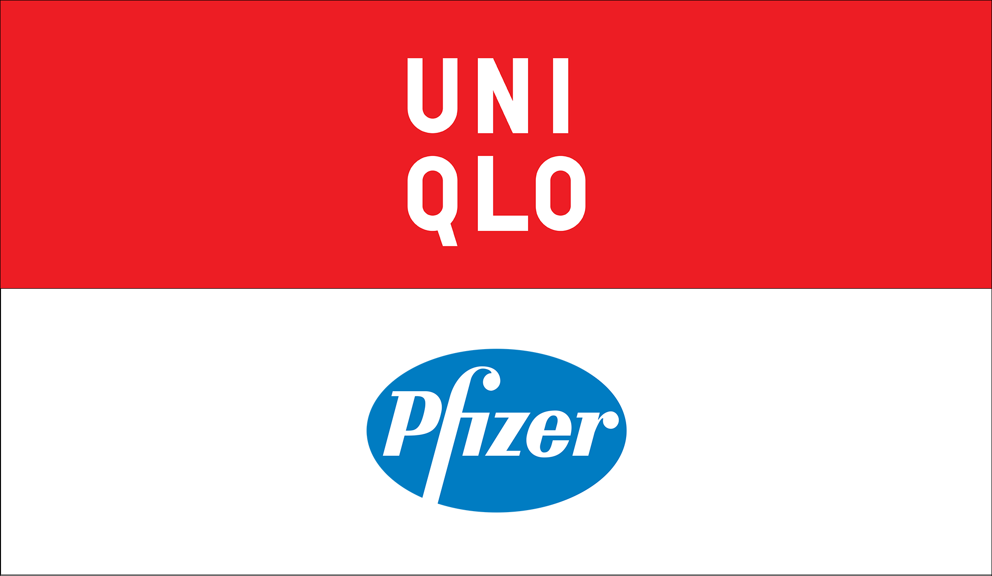
Then there’s the use of stacked text. Uniqlo breaks up its six-letter company name with three letters on each line of its logo to form a square logo. Legibility is important here! Make sure your company name is short enough to stack and that the meaning doesn’t get lost on two lines.
Circular logo shapes aren’t forgotten here, either. Look to long-standing logos like Samsung or Pfizer to see how wordmarks look when contained within a form.
Again, don’t put a wordmark in a circle or square only because you think it’ll look interesting. The shape should serve a design purpose!
Don’ts of designing a wordmark logo
Wordmark logos can feel a little too simple at times, but don;t get carried away giving it a unique look! Keep these don’ts in mind as you tweak your logo.
- Don’t over-do it: Wordmarks are ment to be powerful in their simplicity. Don’t use elaborate display fonts and choose one or two of the elements we mentioned above.
- Prioritize legibility: If your wordmark logo isn’t clear, than it’s going to confuse your customers. Make sure your logo is legible above all, and is easily readable in both digital and print environments.
- Give it space: Be weary of over adjusting the kerning or leading of your logo. Overdoing the spacing can make your logo look unprofessional and unpleasing to the eye. Add or remove spacing in small inciriments at a time.
Wrapping up
Wordmark logos are used widely across industries for a reason — they’re clean and uncomplicated, they boost name recognition, and they’re easy to apply across mediums. Most importantly, they’re timeless.
That said, they’re not always easy to design, especially if you’re not a pro. These logo designs take restraint and laser-sharp attention to detail to get right. With fewer surrounding elements, you have to make sure every character is perfect.
Wordmarks also work best for shorter company names. If that’s not the case for your business, you may want a monogram or lettermark version of your logo for website favicons, apps, and social media.
You can do a lot to make a wordmark logo stand out and look great across channels. But practice restraint with embellishment — simplicity trumps complexity in logo design, and it’ll make the most memorable impression on your target audience.
[Suorce]