More Than a ‘Like’: The Story of the Facebook Logo
With over 3 billion users worldwide, Facebook is the largest social media platform ever created. As one of the original (successful) social networks, Facebook is responsible for the way we’ve adopted social media into our everyday lives.
For better or worse, the Facebook brand has changed how we socialize.
Today, Facebook sits under the umbrella of the Meta brand, a name change that came about in the later part of 2021.
While the visual identity has gone through some important updates since Mark Zuckerberg founded the company back in ‘03, the iconic Facebook logo has, surprisingly, stayed pretty much true to its roots. We’re here to take you through the whole story!
So get ready to absolutely obliterate that Like button. Or, you know. Just enjoy the post…
Facebook logo evolution
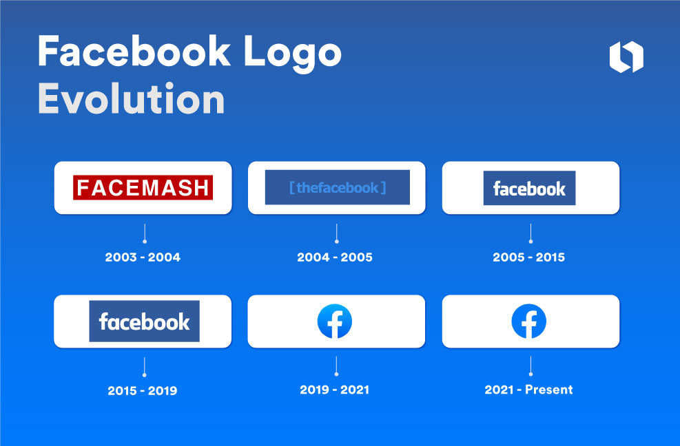
Facebook’s logo hasn’t gone through the kind of rigorous revisions we’ve seen with some other brands. Interestingly, we’ve seen this same logo trend for a number iconic brands.
Touchstone brands like Facebook, Apple, Nike and Amazon all seem to have landed on working versions of their current logos back when they first started. What this suggests is that there’s a correlation between timeless ideas, and the timeless logos that represent them.
A simple logo that roughly captures your brand identity the first time may only need minor revisions through the years.
Here’s a breakdown of the major milestones in Facebook’s logo design, including the evolution of their monogram logo.
2003-2004: Facemash
![]()
Facemash is the brainchild behind the Facebook we know today. Facemash was a notorious attractiveness-comparison app designed by Mark Zuckerberg while still an undergrad at Harvard University in 2003 (which was reportedly terminated after just two days.)
The logo featured an all-caps, spaced-out modern font on a maroon background.
2004-2005: thefacebook
![]()
The first logo featured ‘thefacebook’ as the logo text in square brackets – since the company was still known by that name.
Immortalized in this classic scene from The Social Network, Facebook’s first president and Napster co-founder Sean Parker (played by Justin Timberlake) is attributed with famously prompting the name change that would cement Facebook in the history books.
In 2005, a year after its founding, “TheFacebook” became Facebook, and the logo changed with it.
2005-2015: Just facebook
![]()
The first real Facebook logo reigned for a healthy 10-year stretch. This earlier version, a lower-case adaptation of the Klavika font with rounded corners, sitting in a blue rectangle, featured angled ascenders that give the simple logo movement and dynamism.
It’s a classic for a reason, and has inspired countless wordmark-only tech logos in years since.
2015-2019: The one we all remember
![]()
The next iteration of the Facebook logo featured changes to the typography, primarily for the purposes of improved legibility and immediacy.
The letters received inflated counters (holes in the ‘a’s and ‘o’s) which help the logo breathe, and the original logo’s ‘a’ ascender (the squiggly bit on top) was removed.
Tip: For a speedrun on key Typography concepts, check out our types of fonts guide.
2019-2021: From negative to positive
![]()
The main changes in the current Facebook logo came in 2019, with the removal of the text from its dark blue background.
In essence, the Facebook wordmark went from a negative space logo, to a positive space logo, in 2019. It also received improved spacing, and a punchy update in its color palette, with a light blue logo in sleek and bold lowercase.
2019: Corporate logo (discontinued)
Source: Adweek
The Facebook logo evolution story briefly included an uppercase corporate logo in 2019. With the global launch of Meta and the new umbrella brand, the new Meta logo and symbol replaced this corporate Facebook logo.
2021: Facebook’s monogram logo
![]()
The Facebook icon, used initially just for the app, became the primary logo for the website. The new Facebook logo features a white ‘f’ bounded by a light blue background circle, and features adjusted angles on the cross stroke.
Tip: Like the Facebook icon’s light blue frame, square and circular emblems are some of the most flexible logos when it comes to app symbols, as they fit the 1:1 dimensions of modern phone UI’s nicely.
2023: Gone with the gradient
![]()
Notice anything? You’re not alone if you don’t! In 2023, Facebook announced the first phase of a brand identity refresh with a change to its logo. The removal of the gradient marks a move to “create a refreshed design of the Facebook logo that was bolder, electric, and everlasting.”
While some don’t find the change significant, we “like” the bolder blue, and the move to a flat design feels clean and more modern.
Key logo design elements
The main elements of the Facebook logo have changed in small ways over the years, but the general design approach has remained the same: a lowercase letter logo, monograms for smaller applications, and medium blue as the primary color palette.
The first Facebook logo was designed by Mike Buzzard and Joe Kral. According to Buzzard, the logo is a modification of the Klavika bold font, originally designed by Eric Olson. Kral oversaw actual type modifications and the final wordmark, while Buzzard provided art direction.
The current logo features a white emblem on a blue circular background.
Let’s look in more detail at the recent logo’s design elements and see how the Facebook logo has evolved to suit various digital applications over the years.
This should give you some inspiration for how to adapt your logo to the needs of your users and the context it’ll be displayed in.
Facebook logo color
Facebook’s iconic blue background color (hex code #4267B2, if you’re curious) has been with the company since the beginning. According to a well-known New Yorker piece, Mark Zuckerberg is red-green colorblind but can see all shades of blue.
While a number of articles highlight this as the sole motivation behind Facebook’s logo, we didn’t find direct evidence linking Zuck’s deuteranomaly to the logo color choice itself. But it remains plausible.
More generally, blue is a popular color in branding to evoke a sense of trust and is often favored by tech and social media platforms.
Facebook logo font
Facebook’s logo font is a modification of the sans serif Klavika, designed by Eric Olson. Over the years, the font has received further treatment on the spacing, counter size, and alteration to some of the ascenders.
The original Facebook logo font had angled ascenders over the b and k, and a cursive-style ascender over the a. These were all removed in later iterations, creating a more rounded, unadorned font.
Facebook monogram logo
![]()
The Facebook monogram has also evolved too, and is now the primary logo for the app. Recognized globally, it features the distinct lowercase letter f from ‘facebook’. The monogram uses the brighter, punchier blue that first appeared in the Facebook brand in 2019 (hex code #1778f2).
It’s a great example of a simple yet effective logo that plays with negative space. Granted, the Facebook monogram has the weight of years of brand recognition behind it, but it’s still a good example of how to simplify your own logo into a monogram that’s easy to recognize and distinct.
Impact of the logo on branding and recognition

The Facebook logo is perhaps one of the most famous brand marks ever created. For those of us old enough to remember, the Facebook logo was once synonymous with the website’s classic UI.
Today, the Facebook logo is a classic example of simple, yet effective branding.
Facebook has not been without its controversies over the years. Despite Meta’s own estimates that it has an active user list of 3.03 billion, it’s been speculated that many of these are old, or dormant accounts. Facebook has also seen its growth rates decline in the last few years, but the company contends that it’s far from dead.
What’s not up for discussion is the lasting impact of the Facebook logo, brand, and platform. With the company’s shift towards extended reality and other new social technologies, the Meta logo and brand mark a new era for the social media giant.
Whether the Facebook brand grows any further, stylistically or strategically, remains to be seen.
[source]