Instagram icon vector
Instagram is a popular media sharing and social network platform, which has been around since 2010. Introduced by Kevin Systrom, it grew into a massive international network by 2012, when Facebook purchased it.
Instagram Meaning and history
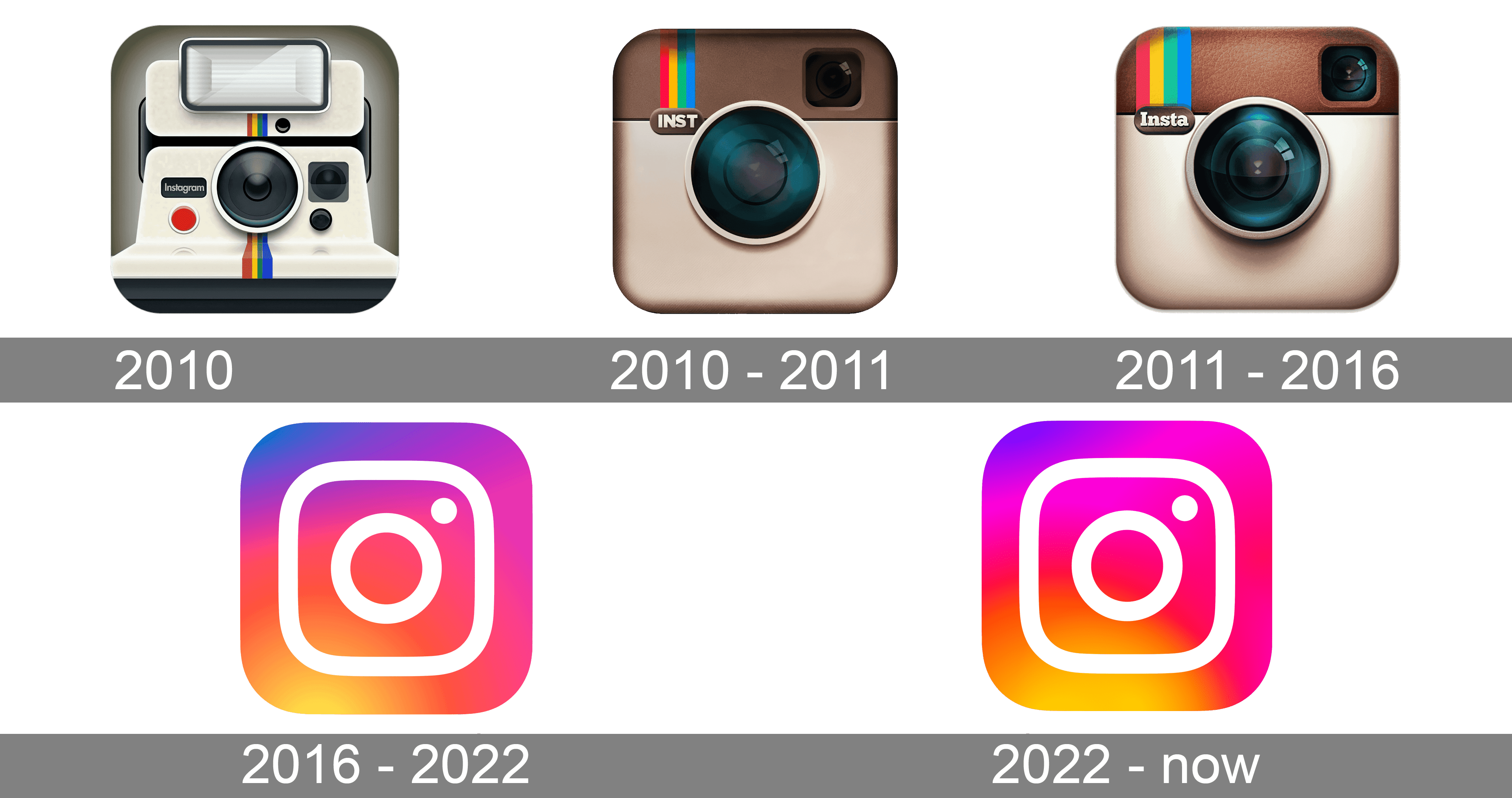
Instagram logo has pretty much paved the platform’s way. Over its brief history, the network has changed a couple of logos. All based on the shape of an instant camera, the known Instagram logo versions have been reflective of the network’s key designation – sharing photographs.
Instagram logo 2010
Instagram logo 2010
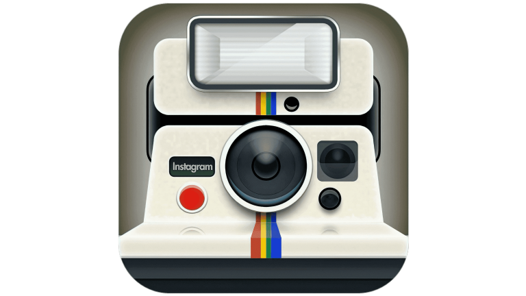
The original Instagram logo was designed by the company co-founder, Kevin Systrom. There was a knock-off Polaroid camera with a rainbow stripe. As the project was originally used for taking and sharing photos (as well as applying filters), the design choice looked pretty natural, and the retro feeling it had was reflecting the original idea of the application. The light milky shade of the camera body looked unique and made the logo stand out in the list of social media competitors. Though the badge stayed in use for just a few months, it was a great beginning of the iconic cam logo era.
Instagram logo 2010 – 2011
Instagram logo 2010 – 2011And yet, later that year Systrom decided to use professional help and hired designer and photographer Cole Rise. He was inspired by the Bell Howell camera from the 1950s. The color palette remained the same, beige and brown, but the shades of the camera body and details were intensified. The new badge was simpler and more memorable due to the use of minimalist shapes and accents. The upper left corner of the camera featured a vertically oriented rainbow flag with the “INST” uppercase lettering in sans-serif set under it.
2011 – 2016
The emblem was slightly updated, but the overall look remained the same. This version made a debut on Instagram v2.0. The leathery texture was added to the upper part of the camera on the badge, the lens got more gradient gloss, which made it look more natural and vivid. The gradients on the camera body got more contrasting, which also added more vitality to the image, making it realistic. The uppercase sans-serif “INST” under the rainbow (which got wider and more visible now), was replaced by a bold serif “Insta” with only the first letter capitalized.
2016 – 2022
The new Instagram logo was unveiled together with an updated application interface. While many users criticized the design, it has remained unchanged for years. The sleek minimalist design of the new logo version is based on the previous Instagram badges but redrawn abstractly and flatly. The gradient orange-to-pink square with rounded angles has a bold camera contouring drawn over it in white. The main shape of the camera repeats the shape of the icon and features a contoured circle in the center and a solid white dot in the upper right corner.
2022 – now
The redesign of 2022 introduced a refreshed version of the Instagram logo from 2016, refining its color palette, but keeping the concept and shapes. The new badge is also executed in gradients from orange to purple, but all shades became lighter, hence now the icon looks even brighter. As for the main elements of the badge, they all stayed at their places — gradient background with a white softened square contour and a circle in the middle, plus a solid white dot in the upper right corner.
By downloading this artwork you agree with our terms of use.
🤔 Not the logo you are looking for? Click here to try a search
Starting download...
5Copy and paste the code for attribution:
Copied
