Michelin Logo Evolution
The Michelin logo, featuring the iconic Michelin Man (Bibendum), has transformed since its debut in 1898. Born from a stack of tires and crafted by French artist Marius Rossillon (O’Galop), it was inspired by the Michelin brothers’ vision at a fair.
Michelin logo 1889–1925
This logo simply consisted of Michelin’s incorporation certificate. In 1898, the company hired cartoonist Marius Rosillon (known as O’Galop) to design the original form of Bibendum, their corporate mascot.
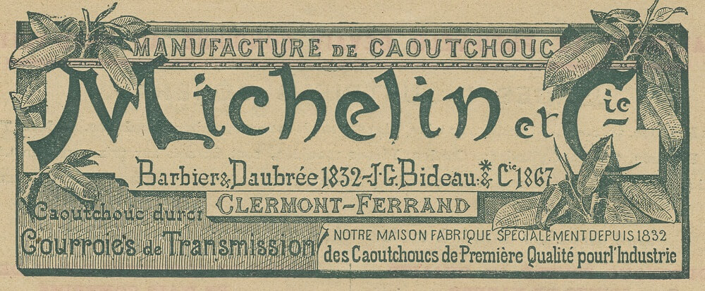
Michelin logo 1889–1925
1936–1968
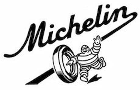
Michelin 1936–1968
This logo acted as a precursor to the Bibendum roller, which became its own logo in the 1970s.
1968–1998

Michelin logo 1968–1998
While the standalone wordmark was their corporate logo, different versions of Bibendum were used to accompany it. This included one running, called the “sprinter“, created in 1984 as part of a redesign of the character; one crossing his arms, mainly used in advertising aired in the US (especially their baby ads); and one rolling a tire, called the “roller”, originally created in the 1970s and modified after his 1984 redesign. The roller was mainly used in Japan in the 1990s, especially for the Green X line.
This wordmark (and the Antique Olive font itself) continues to be occasionally used on the sidewalls of commercial tires.
1998–present

Michelin logo 1998
In 1998, a new logo was introduced to celebrate Bibendum’s centennial and Michelin’s sponsorship of the 1998 FIFA World Cup. The new wordmark is set in Michelin Black, an oblique custom typeface inspired by the previous Antique Olive Nord. Bibendum also received a redesign for the new millennium.
1998–2017
Michelin logo 1998–2017
2017–present
Michelin logo 2017
In 2017, the blue rectangle was retired and Bibendum, now having a more modern look, was moved to the top of the 1998 wordmark.