Walmart logos vector in (.SVG, .EPS, .AI, .CDR, .PDF) free download
- Related:
- Walmart and Target vector logos
We take short and meaningful names of huge companies for granted nowadays, but it wasn’t always like this. For example, when Sam Walton thought about opening a shop – he looked at his rival’s names. It was common to see that business was named with your full name in the 60s, but Sam decided otherwise. He shortened the shop name to Walmart because of signboard cost reduction. And it worked. As did the basic principle of Walmart – low prices and a wide range of goods. Sam Walton’s initial idea was that any person could come to his shop and purchase everything it needed, low prices included of course. And, as we know, it is this strategy that brought prosperity to Walmart company. The company devoured many rivals and none of them was able to fight back.
Walmart logo history

Walmart logo 1962 – 1964
The original Walmart logo was rather simple, it was introduced in 1962. The company’s name was Wal-mart back then.
Then they decided to add a small star as a decoration and the world split in two – Wal and mart. Old Walmart logo color solution was quite basic as well – white letters on a brick-red shield.
Simultaneously, a short slogan was formed: “Always low prices”. However, it was a fresh and original idea for those years and the company lasted for many years with this design solution.
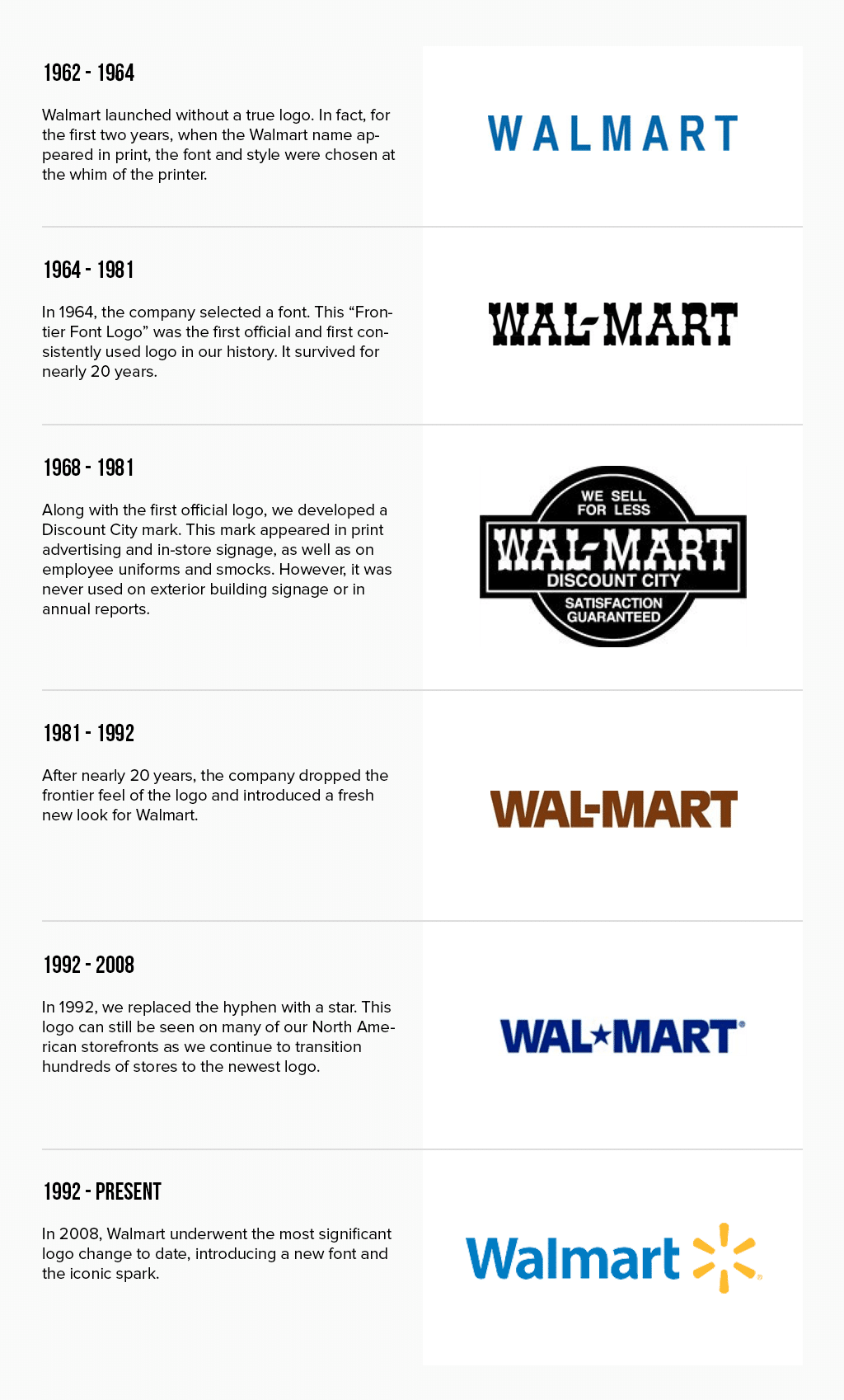
Walmart Logo evolution
Walmart’s logo history can’t boast a variety of changes, and it wasn’t until 2008 when Walmart adopted vector graphics and decided to rebrand.
The habitual star turned yellow, became smaller and moved to the end of the word. “Wal-mart” changed to “Walmart” and the star, in the end, added some colors. This designer move was aimed at richer citizens.
However, it wasn’t only a nice picture that made people rush into Walmart and spend their money there. One way or another, but the old design had grown too compromised and outdated. It was associated with cheap goods of low quality, repelling those, who were able to purchase more expensive, high-quality goods. That’s why they decided to alter the old Walmart logo, making it more friendly and pleasant. And the changes were applied not only to the logo but to the whole company. You can’t promise a new level of services and fail to keep your word, as it surely will ruin your business.
As Sam Walton once said: “It is customers who are true masters and managers of your business, and it is them, who can fire any director or make him a bankrupt. So, if you attempt a rebranding, you must never forget to attempt significant changes in your company as well”.
What Is Walmart Logo Font?
Concise and simple Walmart Logo is featuring a Simple Sans-serif font. The main characteristics of this typeface are its lack of serifs and use of simple and thick lines, smooth angles, lack of serifs.
Walmart logo meaning

Walmart logo 2008 – present
In truth, the logo was adopted to split the word in two stylishly, but nowadays we tend to seek meaning everywhere, even where there is none. As for the hidden message of the Walmart logo, it is considered that it symbolizes 6 sparks. And each spark, in turn, symbolizes ideas, which are making the company successful. They also remind of Sam Walton, who believed in himself and his success. It is this kind of inspiration that we all seek today, and customer inspiration is also a part of Walmart’s logo meaning.
The logo itself is one of the simple and clear ones, as a target group is rather diverse. And as more diverse is the group, the harder it is to face all their needs. However, Walmart’s logo image is intuitively understood as a warm and bright one, it is offering a nice shopping day. Such logos are often apt and thus they are well-remembered by customers, and that is something those logos are meant for, right?
What does the Walmart logo symbolize?
New Walmart logo symbolizes the store’s new eco-friendly policy. The roofs of the company’s buildings began to be equipped with solar panels. They also carry a hidden message: the founder’s faith in his dream and the key principles of the business that makes it successful.
What font is used for the Walmart logo?
When the very first company logo was chosen on a printer by the creator, today’s logo was created using the font Myriad Pro-Bold, but with a change in the capital letter. This font is available for everyone.
How did Walmart get its logo?
Walmart’s logo was coined by founder Sam Walton in 1962. He took the first 3 letters of his last name “Wal” and abbreviated the word “market”. As a result, he got “Walmart”.
Who made the Walmart logo?
Walmart’s newest logo, provided in 2008, was created by Lippincott. This is an American design studio that creates design and business strategies for the largest American corporations such as Duracel.
Why is the Walmart logo multicolored?
The new logo has changed the color scheme to rich orange and deep blue, which makes it more friendly and aesthetically pleasing. And also to attract more wealthy clients.
- 2021–22 La Liga Clubs logos
- 2021/2022 Premier League Club logos vector
- 2021/2022 UEFA Champions League Club logos vector
- 2022 FIFA World Cup team logos vector
- 2022–23 UEFA Champions League club logos vector
- 2022/2023 Premier League Club logos vector
- 2023–24 Eredivisie clubs logo vector
- 2023–24 La Liga club logos vector
- 2023–24 Premier League club logos vector
- 2024–25 Premier League team logos in vector format
- Bundesliga 2021/2022 club logos vector
- Clothing brand logos vector
- EFL League One clubs logos
- EFL League Two clubs logos
- France Ligue 1 Team Logos vector
- Google Workspace apps logo vector
- KHL teams logos vector
- MLS Team Logos vector
- NBA Teams logo vector
- NFL team logos vector
- NHL teams logos vector
- Premier League Team Logos vector
- Serie A Club logos vector
- UEFA Champions League team logos vector
- Vector logos of football clubs in England
- Vector logos of football clubs in the Netherlands
- Vector logos of top 50 airline brands


