Olympics logos vector in (.SVG, .EPS, .AI, .CDR, .PDF) free download
The modern Olympic Games or Olympics are the leading international sporting events featuring summer and winter sports competitions in which thousands of athletes from around the world participate in a variety of competitions.
The Olympic Games are normally held every four years, and since 1994, has alternated between the Summer and Winter Olympics every two years during the four-year period.
Olympics logo history
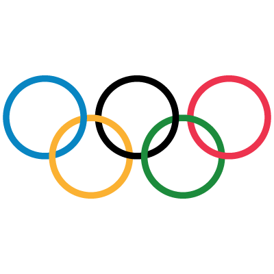
The original iconic five rings logo of the Olympic Games was introduced in 1912 and featured thick lines of the five colored elements. The badge looked solid and bright, yet in comparison to the current logo, it was a bit heavier and darker.
The redesign of 1986 refined the contours of the rings and added some thin white lines to the place of their intertwining. The colors were also refined and made more delightful.
This logo definitely looked more professional and stylish than the original version.
- 2021–22 La Liga Clubs logos
- 2021/2022 Premier League Club logos vector
- 2021/2022 UEFA Champions League Club logos vector
- 2022 FIFA World Cup team logos vector
- 2022–23 UEFA Champions League club logos vector
- 2022/2023 Premier League Club logos vector
- 2023–24 Eredivisie clubs logo vector
- 2023–24 La Liga club logos vector
- 2023–24 Premier League club logos vector
- 2024–25 Premier League team logos in vector format
- Bundesliga 2021/2022 club logos vector
- Clothing brand logos vector
- EFL League One clubs logos
- EFL League Two clubs logos
- France Ligue 1 Team Logos vector
- Google Workspace apps logo vector
- KHL teams logos vector
- MLS Team Logos vector
- NBA Teams logo vector
- NFL team logos vector
- NHL teams logos vector
- Premier League Team Logos vector
- Serie A Club logos vector
- UEFA Champions League team logos vector
- Vector logos of football clubs in England
- Vector logos of football clubs in the Netherlands
- Vector logos of top 50 airline brands
