51 Creative Logos That Use Negative Space Brilliantly
In art and design, negative space is the background space around and between the subject of an image. For example, in a picture of a palm tree against the sky, the shape of the tree is the positive space. The sky and the space between the branches and leaves is the negative space.
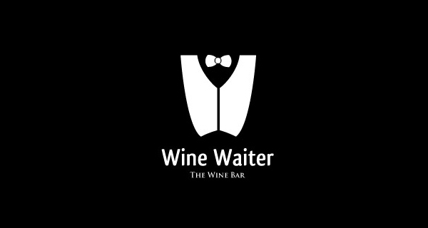
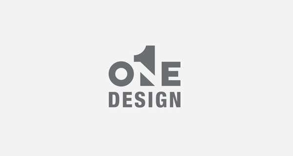
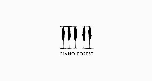
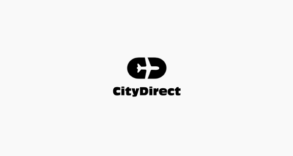
Negative space can be used creatively to form compelling visuals that have dual or hidden meanings. This is usually possible with duo-tone (two color) images where the subject forms a silhouette against the background. Artists like Noma Bar and Tang Yau Hoong are well-known masters of the art of negative space.
In today’s post, we focus on the creative application of negative space in logo design. We’ve compiled a list of 51 brilliant logos that use negative space to form a clever visual representation of the brand name, or in some cases, explain the nature of the business. Check them out below.
1.
![]()
2.
![]()
3.
![]()
4.
![]()
5.
![]()
6.
![]()
7.
![]()
8.
![]()
9.
![]()
10.

11.
12.
13.
14.
15.
16.
17.
 The hand and leg enclosure forms the map of Australia
18.
19.
20.
21.
22.
 The negative spaces between the legs create the shapes of famous NYC buildings
23.
24.
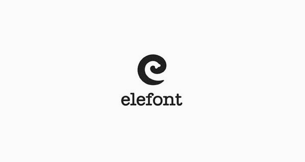
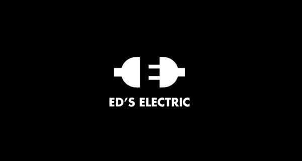 A plug, a socket, and an ‘E’ in the middle
25.
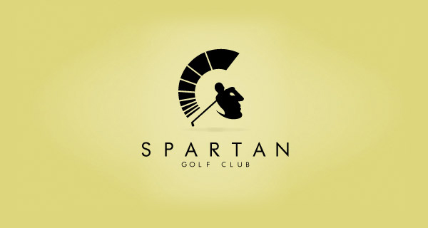 A golfer + the profile of a Spartan wearing a helmet
26.
 There’s a knife in the letter ‘a’
27.
28.
29.
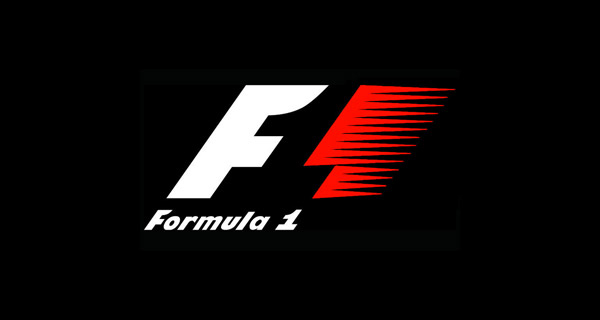 The number ‘1’ can be seen between the white ‘F’ and the red waves
30.
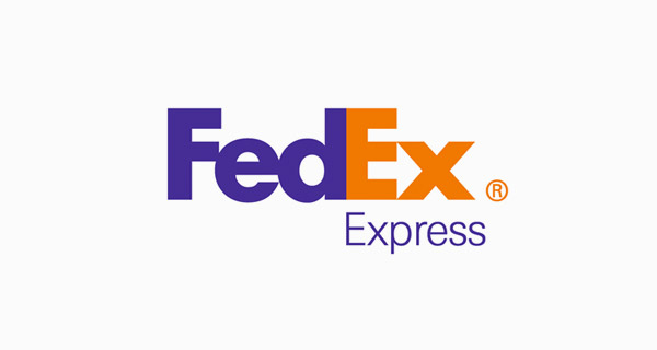 There’s an arrow in the negative space between the E and the X
31.
32.
33.
34.
35.
36.
37.

38.

39.
40.
41.

42.
43.

44.
45.

46.
47.

48.

49.
50.
51.
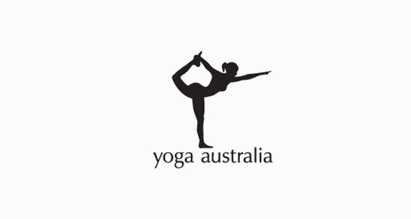
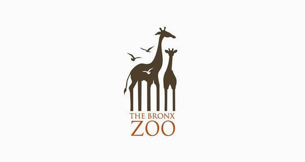
Our top three: No. 4 (Pittsburgh Zoo), 17 (Yoga Australia), and 25 (Spartan Golf Club). What about you? Share this post with a designer friend and voice your views in the comments below.