National Hockey League (NHL) logos vector free download
The National Hockey League (NHL) is a professional ice hockey league in North America comprising 32 teams—25 in the United States and 7 in Canada.
NHL logo history
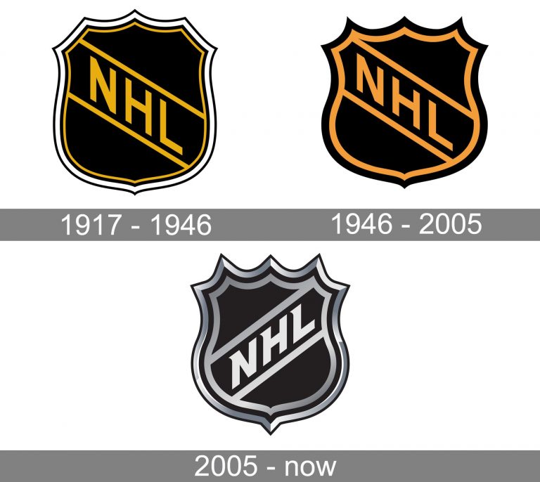
NHL logo Meaning and history
The visual identity of the National Hockey League has been very constant and stable throughout the league’s history. Once created, in 1917, its logo became just a bit modified by today, showing the strength and seriousness of the NHL.
Current emblem
The current logo, which was adopted in 2005, looks very similar to the previous one, at least the core visual metaphor remains the same: a shield shape.
However, the black-and-brown color scheme has been replaced by the black-and-white one (with shades of silver grey). One more notable change refers to the way the diagonal lettering is positioned (it goes upward now). The typeface has also been slightly tweaked.
- 2021–22 La Liga Clubs logos
- 2021/2022 Premier League Club logos vector
- 2021/2022 UEFA Champions League Club logos vector
- 2022 FIFA World Cup team logos vector
- 2022–23 UEFA Champions League club logos vector
- 2022/2023 Premier League Club logos vector
- 2023–24 Eredivisie clubs logo vector
- 2023–24 La Liga club logos vector
- 2023–24 Premier League club logos vector
- 2024–25 Premier League team logos in vector format
- Bundesliga 2021/2022 club logos vector
- Clothing brand logos vector
- EFL League One clubs logos
- EFL League Two clubs logos
- France Ligue 1 Team Logos vector
- Google Workspace apps logo vector
- KHL teams logos vector
- MLS Team Logos vector
- NBA Teams logo vector
- NFL team logos vector
- NHL teams logos vector
- Premier League Team Logos vector
- Serie A Club logos vector
- UEFA Champions League team logos vector
- Vector logos of football clubs in England
- Vector logos of football clubs in the Netherlands
- Vector logos of top 50 airline brands
